


Embrace Earthy, Grounding Tones
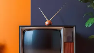
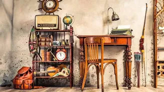
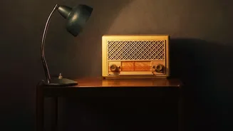
One of the most accessible entry points into vintage decor is through the earthy colours of the 1960s and 70s. Think of shades like mustard yellow, avocado or olive green, burnt orange, and deep, chocolatey browns. These colours evoke a sense of warmth
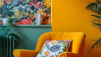
and comfort, grounding a room and making it feel instantly inviting. They pair beautifully with natural materials like dark wood furniture, cane, rattan, and textured fabrics such as corduroy or velvet. To keep the look from feeling dated, use these colours as part of a considered scheme. For instance, paint a single feature wall in a rich mustard yellow or find a statement armchair in olive green. This allows the vintage hue to shine without overwhelming the space. In Indian homes, these earthy tones like terracotta and ochre resonate deeply with traditional aesthetics, blending seamlessly with local crafts and textiles.
Play with Muted Pastels
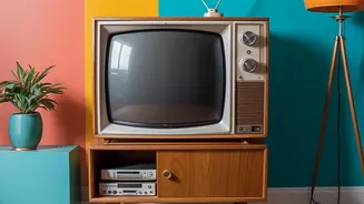
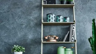
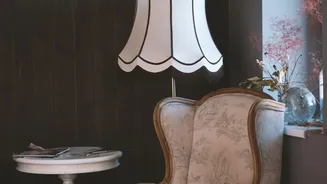
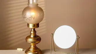
If bold earth tones aren't for you, consider the softer side of vintage. Muted and dusty pastels, reminiscent of the 1950s or even earlier Victorian times, can bring a subtle, romantic charm. Shades like dusty rose, sage green, powder blue, and butter yellow offer a gentle dose of colour that feels both nostalgic and sophisticated. These colours are particularly effective in creating a serene and airy atmosphere. They work well for larger areas like walls, especially when you want to avoid stark white. Pair them with creamy off-whites and light-coloured woods for a soft, layered look. To give these pastels a modern edge, contrast them with sharp, clean lines in your furniture or introduce metallic accents like brass or gold in lamps and fixtures.
Introduce Rich Jewel Tones
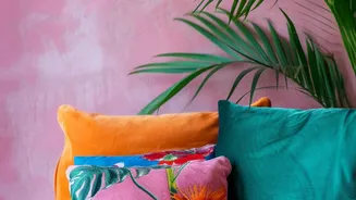
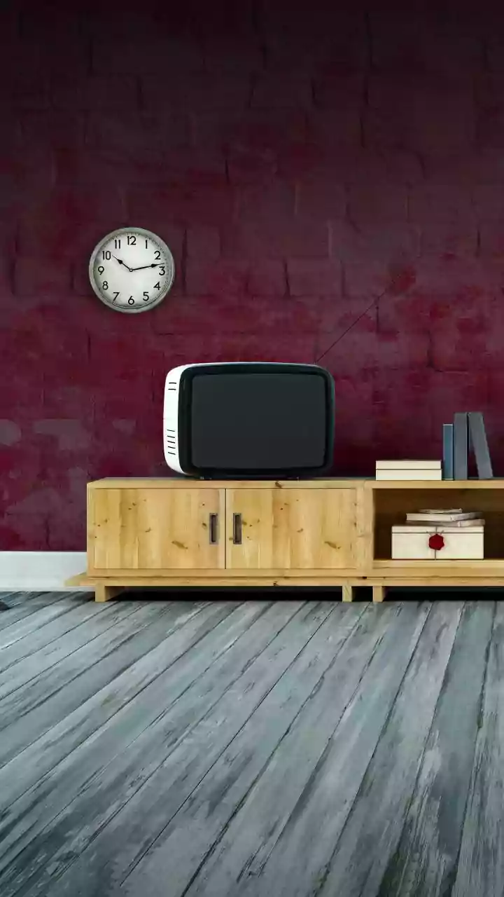
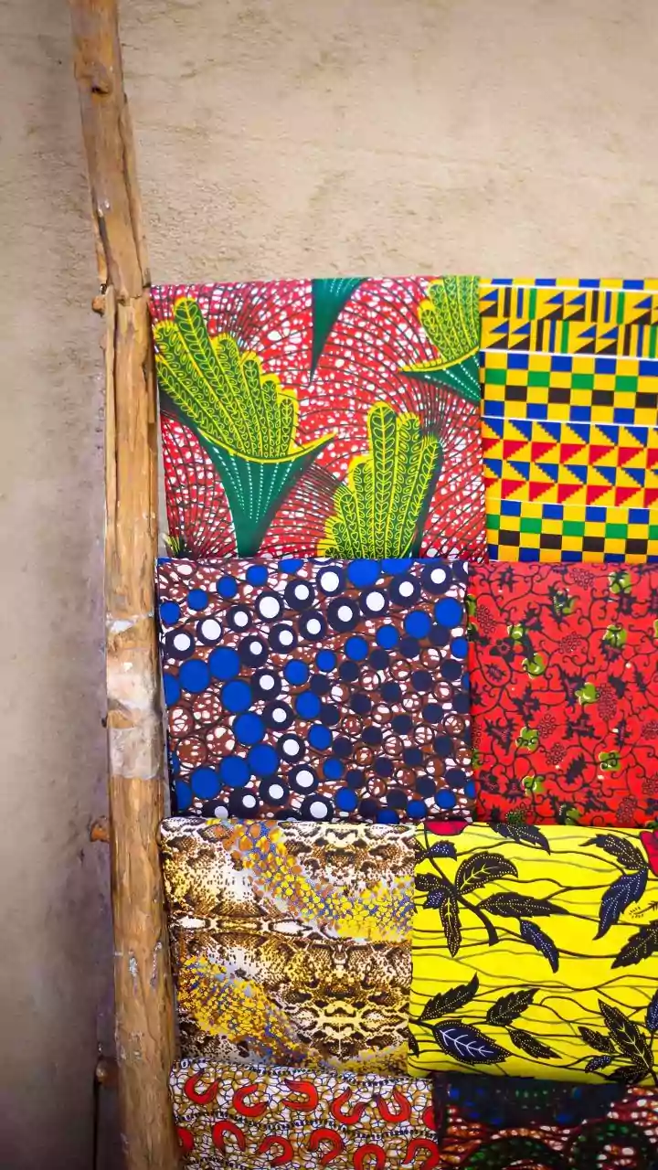
For a touch of opulence and drama, look to the jewel tones popular in Art Deco and traditional Indian design. Deep emeralds, sapphire blues, ruby reds, and rich purples can make a powerful statement. Because these colours are so saturated, they are often best used as accents. Consider a velvet sofa in a deep emerald green, plush cushions in ruby red, or a statement rug that combines several of these luxurious shades. When used against a neutral backdrop, these pops of colour create striking focal points that feel both regal and curated. This approach allows you to inject personality and a sense of history into your space without committing to a dark, heavy colour scheme throughout the room.
Balance is Key: The Role of Neutrals
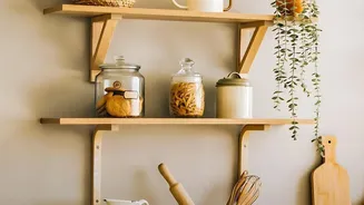
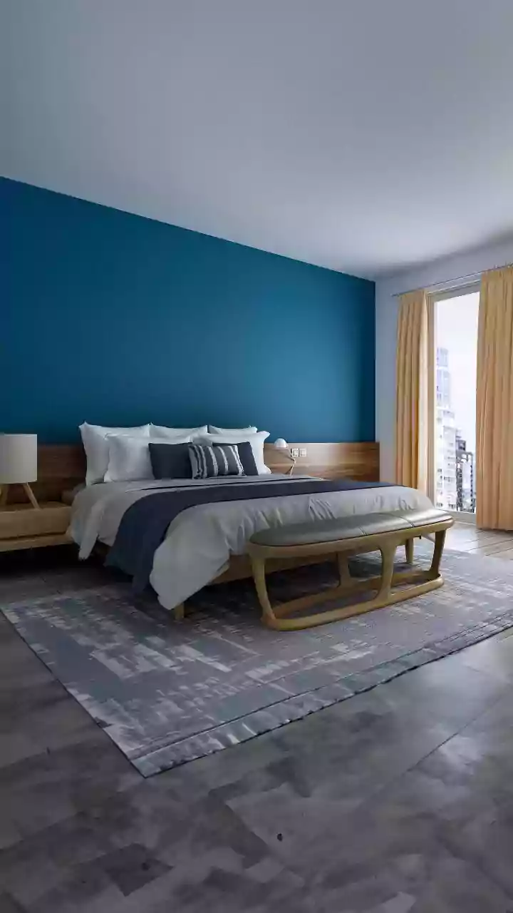
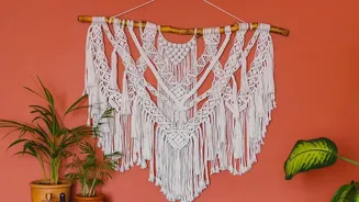
The secret to making vintage colours look timeless, rather than just old, is balance. A neutral foundation is crucial. Walls painted in warm whites, soft greys, or creamy beiges provide a clean canvas that allows your chosen vintage shades to stand out. This neutral backdrop prevents the colours from competing with each other and keeps the room feeling bright and modern. An all-neutral palette can even have a retro feel on its own when combined with vintage-inspired textures like bouclé or cane and sculptural furniture shapes. This strategy of pairing bold or muted vintage colours with a modern, neutral base is the cornerstone of creating a transitional style that feels both personal and enduring.
Follow the 60-30-10 Rule
A classic interior design principle that works wonders with vintage palettes is the 60-30-10 rule. This guideline helps create a balanced and harmonious look. Your dominant colour (60%) should be a neutral shade used for walls and large furniture items. Your secondary colour (30%) can be your chosen vintage hue—perhaps a muted pastel or an earthy tone—used for accent furniture, curtains, or a feature wall. Finally, your accent colour (10%) should be your boldest shade, like a vibrant jewel tone, used sparingly in cushions, artwork, or decorative objects. This structured approach ensures that the colours are layered thoughtfully, creating a cohesive and polished space where the vintage elements feel intentional and chic.