


What Exactly Is Negative Space?
In design, negative space refers to the unoccupied area around and between objects. It’s not just an empty wall; it's the 'breathing room' that gives your decor impact. Think of it as the quiet pause in a melody or the margin on a page that makes the text
readable. This space is an intentional design choice that guides the eye, prevents visual clutter, and allows the key elements in your room—like a vibrant piece of art—to truly shine. Without it, even the most beautiful items can get lost in a sea of stuff, creating a sense of chaos rather than calm.
The Confident Appeal of Colour-Blocking
Colour-blocking is a design technique that involves pairing two or more solid blocks of colour to create a single, impactful statement. It’s a confident and modern approach that trades busy patterns for the pure, graphic power of hue. Whether it’s a painting with bold geometric shapes or a large, single-colour canvas, this style of art is meant to be assertive. The beauty of colour-blocking lies in its simplicity and its ability to inject personality and visual structure into a space. However, its boldness is also its biggest challenge; without the right context, it can easily overwhelm a room.
The Perfect Partnership: Why It Works
This is where negative space becomes colour-blocking’s best friend. The visual quiet of an unadorned wall provides the perfect counterbalance to the intensity of colour-blocked art. It gives the eye a place to rest, which in turn makes the colours appear more vibrant and the shapes more defined. Psychologically, this balance reduces our cognitive load; a cluttered environment can increase stress, while a well-spaced one promotes a sense of calm and order. The negative space acts as a frame, elevating a piece of art and making it feel more significant and intentional, much like how a museum displays a masterpiece.
Make a Single Piece the Hero
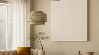
One of the most effective ways to use this pairing is to let a single, large piece of colour-blocked art become the room's focal point. To do this, you need to be generous with the negative space surrounding it. Instead of centering it perfectly, consider an asymmetrical placement—hanging the art slightly off-centre or lower than expected. This creates a dynamic tension that is far more compelling. The surrounding emptiness becomes an active part of the composition, drawing the eye toward the artwork and giving it an undeniable presence. This technique works especially well on a large wall where the art has ample room to breathe.
Arranging a Colour-Blocked Gallery Wall
If you prefer multiple pieces, negative space is the key to creating a cohesive gallery wall rather than a chaotic jumble. The trick is to maintain consistent spacing between each frame, typically between 2 to 4 inches. This uniform gap creates a visual rhythm that ties the individual artworks together. You can start with a central anchor piece and build your arrangement outwards, ensuring the entire grouping is balanced. It's also effective to mix bold, colour-blocked pieces with quieter works that feature more internal negative space. This creates those essential visual pauses, allowing each piece to be appreciated on its own terms within the larger collection.
Tips for Your Own Walls
Ready to try it yourself? Start by considering scale. A piece of art should generally occupy about two-thirds of the width of the furniture it hangs above. Don’t be afraid to go big with your art, but be equally bold with your use of empty space. Lighter-coloured walls can enhance the feeling of openness and make art seem to float, while darker walls can create a dramatic, high-contrast backdrop. Before you hang anything, you can even map out your arrangement on the floor to see how the spacing feels. Remember, the goal is to make a conscious choice about where you place things—and where you don't.