




Start with a Neutral Foundation
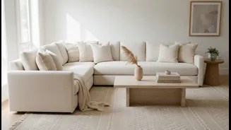
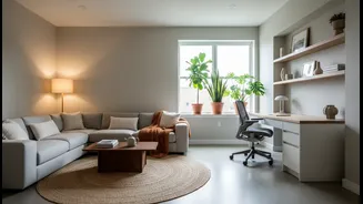
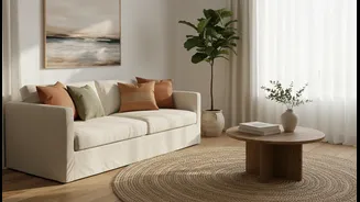
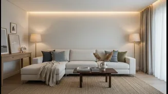
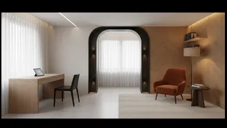
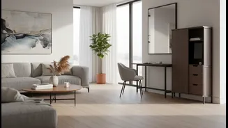
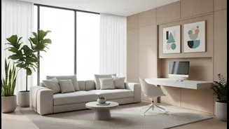
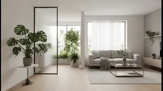
The first step towards a timeless space is creating a calm, cohesive backdrop. This almost always begins with neutrals. But 'neutral' doesn't just mean white or beige. Think of warm greys, soft creams, earthy browns, and even muted blue-greys. These colours
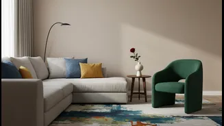
create a versatile canvas that allows your furniture, art, and accessories to shine. Using one main neutral colour for the majority of the room, like the walls, visually ties the space together and creates an 'interior envelope'. This approach provides a sense of order and calm, preventing the space from feeling chaotic or overly busy. A solid neutral base is the bedrock of restraint, allowing you to introduce colour thoughtfully rather than impulsively.
Apply the 60-30-10 Rule
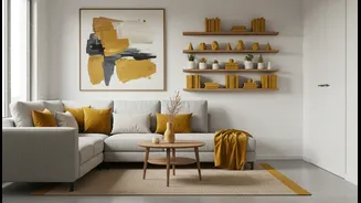
One of the most reliable principles in interior design is the 60-30-10 rule. It’s a simple formula for achieving a balanced colour scheme. Your room should be 60% a dominant, neutral colour (your walls and large furniture pieces), 30% a secondary colour, and 10% an accent colour. The secondary colour should complement the dominant one and add interest. This could be the colour of your curtains, an accent chair, or an area rug. The final 10% is where you have fun and show personality with bold pops of colour through throw pillows, vases, or artwork. This rule ensures that colour is layered and intentional, preventing any single hue from overpowering the room and helping you exercise that crucial restraint.
Choose Colours with Staying Power
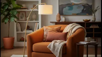
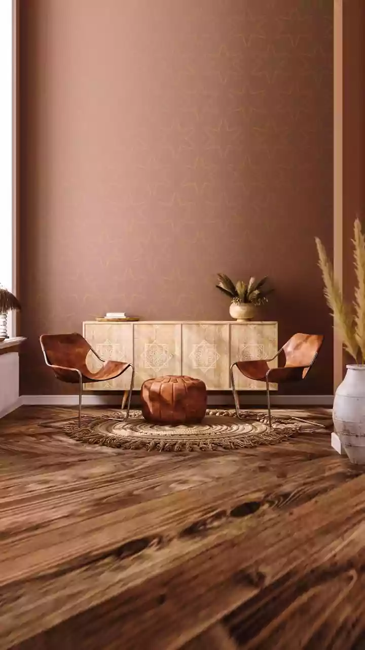
While trendy colours can be exciting, they often feel dated within a few years. For a timeless living room, lean into colours that have a rich, enduring quality. Deep jewel tones like emerald green, sapphire blue, and muted maroon bring a sense of luxury and depth that never goes out of style. Similarly, earthy shades inspired by nature—such as terracotta, sage green, and mustard yellow—create a warm, grounded atmosphere. These colours feel rooted and authentic. For an Indian context, shades like indigo, saffron, and deep oranges connect to cultural heritage and add a layer of warmth and meaning. The key is to choose saturated, complex tones over bright, primary ones, as they tend to feel more sophisticated and less likely to fall out of fashion.
Introduce Colour Through Texture and Pattern
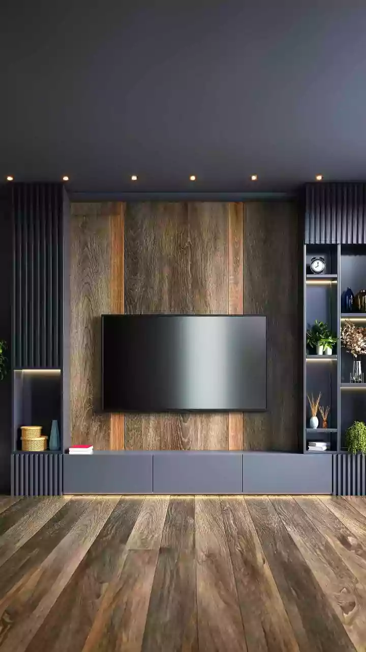
Colour doesn't have to come from a paint can. One of the most effective ways to create a sophisticated, layered look is by introducing colour through different materials and textures. Think of a velvet sofa in a deep blue, a set of silk cushions in a rich emerald, or a woollen throw in a warm terracotta. These textiles add tactile richness and depth. Wooden furniture in warm tones, brass or gold metallic accents, and patterned rugs are also excellent ways to weave colour into your design scheme. An oriental or traditional Indian rug can be a fantastic starting point, providing a ready-made palette of harmonious colours to draw from for the rest of your room. This approach feels more organic and curated than simply painting a feature wall.
Embrace the Single Statement Piece
Restraint is about making choices. Sometimes, the most powerful way to use colour is to let one significant piece do all the talking. Instead of scattering colour everywhere, consider investing in a single, bold statement item. This could be a large-scale piece of abstract art with vibrant hues, a beautifully upholstered armchair in a daring colour, or a striking cabinet. By keeping the surrounding elements relatively neutral, this one piece becomes a dramatic focal point without creating visual clutter. It’s a confident design move that says you appreciate colour but know how to use it with purpose. This approach perfectly embodies the idea of using colour without sacrificing the serene, uncluttered feeling that is the hallmark of a truly timeless room.