



The Secrets Behind the Sizzle
In the world of food photography, what you see is rarely what you get. The goal is to create a mouth-watering image that can withstand hours under hot studio lights, and that often requires a little bit of inedible magic. That glistening stack of pancakes
is likely doused in motor oil, not syrup, because oil doesn't absorb into the cakes. The perfect bowl of cereal? The 'milk' is often white glue, which keeps the flakes from getting soggy. And those perfect, juicy grill marks on a burger or steak are frequently branded on with a hot metal rod or even drawn on with shoe polish. Other tricks include using mashed potatoes dyed to look like ice cream (because it doesn't melt), soap bubbles to create fizz in drinks, and injecting meat with fillers to make it look plumper. It's an art of deception, designed to make you crave something that, in its photographed form, would be completely inedible.
Why Our Brains Equate Pretty with Healthy
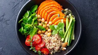
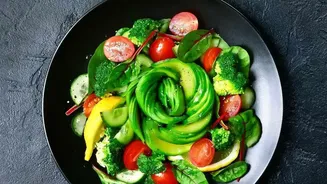
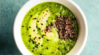
Our attraction to beautifully presented food isn't just a matter of taste; it's deeply rooted in psychology. Research from institutions like the University of Southern California has shown that consumers have a powerful bias: we tend to believe that pretty food is healthier. This is sometimes called the 'health halo' effect. When we see food that is neat, symmetrical, and colourful, our brain associates it with naturalness and, by extension, good nutrition. For example, a study presented subjects with two images of avocado toast. One showed the avocado neatly sliced and arranged, while the other showed it sloppily smeared. Overwhelmingly, people perceived the prettier version as healthier, less fatty, and lower in calories, even though the ingredients were identical. Advertisers and restaurants use this cognitive bias to their advantage, knowing that an aesthetically pleasing plate can influence our choices and even how much we're willing to pay.
The 'Healthy' Food Illusion
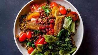
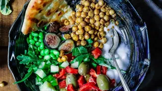
This effect is particularly potent when it comes to foods already marketed as 'healthy'. A salad in a commercial might look incredibly crisp and fresh, but those greens might have been spritzed with hairspray or glycerin to give them a lasting dewy sheen. Fruits are often chosen for their perfect, uniform appearance—sometimes when they are still underripe—and then sprayed with deodorant to make them shine. The vibrant colours aren't always natural, either. Food stylists are masters of composition, using lighting and careful arrangement to make healthy ingredients pop, creating a visual that screams vitality and freshness, even if the actual product is less than spectacular. This is why a packaged salad mix rarely looks as good at home as it does on the bag. The image is an idealised version, not a reflection of the everyday reality.
How to See Past the Polish
So, how can you become a more discerning consumer? The first step is to be skeptical of perfection. Real food has flaws—it's rarely symmetrical, uniform in colour, or perfectly shaped. The most important information isn't on the front of the package, which is pure marketing, but on the back. Get into the habit of reading the nutrition facts panel and the ingredients list. An ingredient list is ordered by weight, so the first few items make up the bulk of the product. If sugar or processed oils are near the top of the list, it's not a healthy choice, no matter how beautiful the photo on the box is. Also, be wary of buzzwords like 'natural' or 'low-fat', which can be misleading. A 'low-fat' product, for instance, might be loaded with sugar to compensate for the lack of flavour.