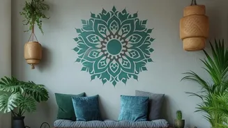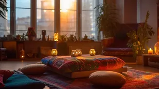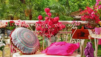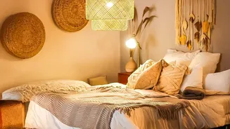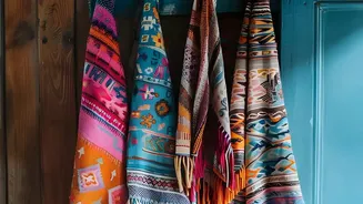


Start with a Cohesive Colour Palette
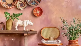
Before you even think about patterns, decide on your colour story. A unified colour palette is the single most important element that will tie everything together. Bohemian style often leans into warm, earthy tones like terracotta, mustard, and deep browns,
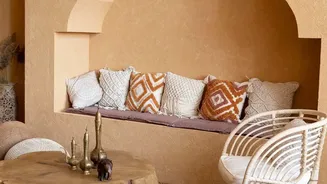
but it also embraces jewel tones like sapphire and emerald. Your chosen patterns don't need to match, but they should share at least one or two common colours. This creates a visual thread that guides the eye, making the mix of florals, geometrics, and tribal prints feel intentional rather than accidental. A neutral base of cream or beige walls can provide a calm canvas, allowing your patterned pieces to truly shine without overwhelming the space.
Master the Rule of Scale
The key to preventing patterns from visually competing is to vary their scale. If all your patterns are the same size, the room will feel busy and flat. Instead, follow a simple design principle: combine large-scale, medium-scale, and small-scale prints. For example, you might choose a large, bold geometric or tribal pattern for a statement rug. This becomes your dominant pattern. Next, layer in a medium-scale pattern, like a floral or paisley on throw pillows. Finally, add a small, subtle print through a small decorative object or a light throw blanket. This hierarchy allows each pattern to have its own space to breathe, creating depth and dimension.
Stick to an Odd Number of Patterns
In design, odd numbers often create a more dynamic and less formal look, which is perfect for the relaxed boho aesthetic. When mixing patterns, a good rule of thumb is to work in threes or fives. For instance, in a single area like a sofa, you might use three different patterned cushions. Or for the whole room, you could have a main pattern on the rug, a second on the curtains, and a third spread across your cushions. This guideline helps you exercise restraint. While boho embraces maximalism, there's a fine line between 'collected' and 'chaotic'. Limiting your pattern count to a curated selection keeps the look feeling purposeful.
Incorporate 'Breathing Room' with Solids
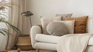
A common mistake when decorating in a bohemian style is forgetting to give the eye a place to rest. Not every surface needs to be covered in a pattern. Solid colours are crucial for balancing the visual energy of your prints. Use solid-coloured furniture, like a simple linen sofa or a solid wood coffee table, to ground the space. A solid-coloured throw blanket draped over a heavily patterned armchair can also break up the visual intensity. These neutral 'breathing rooms' make the surrounding patterns pop more effectively and prevent the space from feeling overcrowded.
Don't Forget About Texture
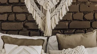
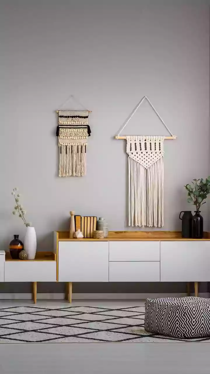
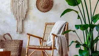
In the world of boho design, texture essentially acts as another form of pattern. A chunky knit throw, a macrame wall hanging, a jute rug, or a velvet cushion add a rich tactile dimension that is just as important as printed fabric. Layering different textures adds depth and warmth, making a room feel cosy and inviting. The beauty of texture is that it can provide the 'patterned' feel without adding more visual noise. You can mix a smooth silk pillow with a rough burlap one and a fringed cotton one to create interest that doesn't clash with the primary patterns in the room.