



The Allure of Vintage Patterns
From the intricate, swirling motifs of Damask to the pastoral scenes of Toile and the bold florals of Chintz, vintage patterns tell a story. These designs, popular in previous eras, add a layer of personality and timeless elegance that modern, minimalist
decor sometimes lacks. Whether it's an Art Deco geometric, a mid-century abstract, or a classic paisley, incorporating vintage prints connects your home to a rich design history, making a space feel curated and personal. The challenge, however, is to prevent your home from looking like a museum or a jumbled antique shop. The key is not to add more, but to create a deliberate and balanced conversation between the old and the new.
Harnessing the Power of Neutrals
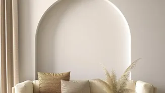
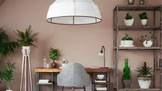
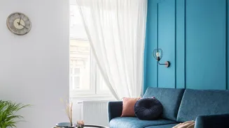
A neutral colour palette is your most powerful tool for achieving balance. Think beyond just white and beige; neutrals encompass a wide range of calming hues, including soft greys, warm taupes, creamy whites, and even muted shades of green and blue. These colours create a serene backdrop that allows bold vintage patterns to shine without competing for attention. By using neutrals on your largest surfaces, like walls and major furniture pieces, you establish a solid, calming foundation. This 'neutral envelope' provides the visual breathing room necessary to let your chosen vintage patterns become celebrated focal points rather than chaotic noise.
Apply the 60-30-10 Rule
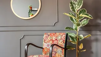
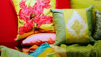
A classic interior design principle, the 60-30-10 rule is a simple formula for creating a balanced room. It dictates that 60% of your room should be a dominant colour, 30% a secondary colour, and 10% an accent. To adapt this for vintage patterns, think of it this way: 60% should be your primary neutral (walls, sofa, large rug), 30% can be a secondary neutral or a subtle, small-scale pattern, and the final 10% is reserved for your bold vintage pattern. This accent could be featured on throw pillows, an armchair, a piece of art, or curtains. This framework ensures your statement pattern makes an impact without overwhelming the eye.
Choose One Dominant Pattern
When mixing patterns, it's crucial to choose one to be the star of the show. Trying to incorporate multiple large-scale, competing vintage patterns is often where designs go wrong. Select one pattern that you truly love and make it the focal point. For example, if you have a sofa with a bold floral chintz, keep the surrounding elements more subdued. You can then introduce other, smaller-scale patterns, like a fine stripe or a simple geometric, in your '30%' or '10%' categories. The key is to vary the scale; a large floral can work beautifully with a small check, as long as they share a common colour to tie them together.
Layer with Texture for Depth
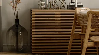
A neutral room is never boring if it’s rich in texture. Since you're keeping the colour palette calm, texture becomes essential for adding depth and interest. Mix a variety of materials to create a tactile and inviting space. Combine soft elements like wool throws, velvet cushions, and linen curtains with harder surfaces like raw wood, polished metal, or stone. A chunky woven rug, a smooth leather armchair, and a polished brass lamp can all coexist beautifully within a neutral scheme. This textural variety prevents the room from feeling flat and makes the neutral backdrop feel rich and intentional.
Putting It All Together
Start by establishing your neutral base on walls and large furniture. Choose your standout vintage pattern and decide where it will make the most impact—perhaps as an upholstered headboard in the bedroom or a stunning roman blind in the kitchen. Layer in your secondary neutrals through bedding, curtains, or a secondary furniture piece. Finally, add your 10% accent pattern on smaller items. Remember that different patterns from different eras can coexist if they are connected by a shared colour palette. Most importantly, trust your instincts; the goal is to create a space that feels personal and harmonious to you.