

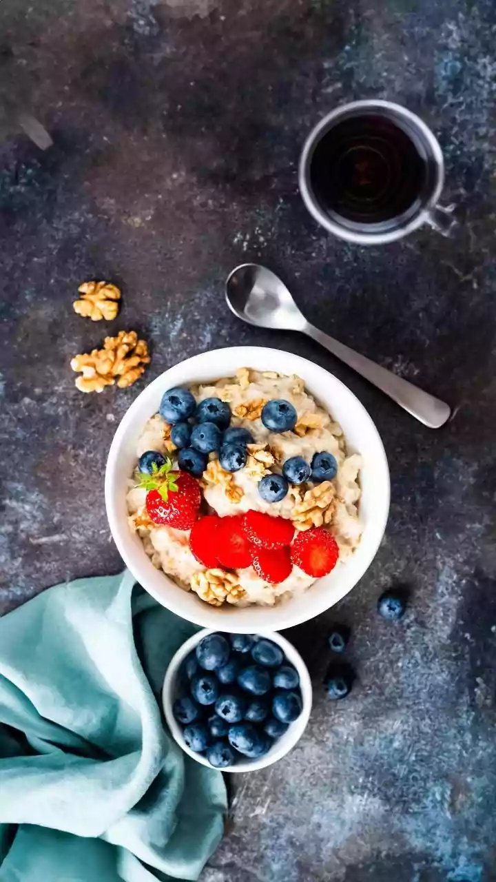




The Pretty and Healthy Illusion
We have a built-in bias: we tend to believe that food presented beautifully is also healthier for us. A series of studies led by researcher Linda Hagen at the University of Southern California explored this very phenomenon, finding that consumers consistently
rate prettier versions of the same food as being more nutritious, less fatty, and lower in calories. In one test, participants were shown photos of avocado toast. Even when told the ingredients were identical, the neatly presented toast was perceived as more natural and healthier than a messier version. This 'pretty equals healthy' bias can influence not just our opinions, but our willingness to pay more for a dish that simply looks better.
Why Order and Symmetry Matter
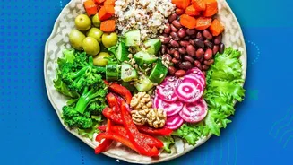
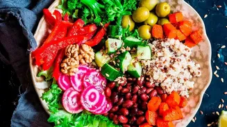
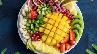
The effect isn't just about being 'pretty' in a general sense. The research points specifically to what are called classical aesthetics—principles like order, symmetry, and balance. Our brains associate these organized, nature-like patterns with things that are natural and pure. Think of the perfect symmetry of a butterfly's wings or the ordered structure of a honeycomb. When food mimics these patterns—a perfectly arranged salad, an artfully constructed hamburger—our minds make a subconscious leap, associating that visual order with naturalness, and therefore, with healthiness. This happens even for foods that are decidedly unhealthy, suggesting that a well-styled photo of a pizza or burger can trick our brains into viewing it more favourably.
Beyond the Food Itself
It’s not just the food’s arrangement but also its container that influences our judgment. Studies have shown that even the design of the plate can change how we perceive a meal. Research published in the journal 'Foods' found that participants rated food served on more beautiful plates as both tastier and healthier. Different types of aesthetic designs on plates can also evoke different emotional responses. For example, one experiment found that plates with 'expressive' aesthetics (more artistic and less symmetrical) elicited stronger positive or negative emotions compared to plates with classical, balanced designs. This suggests that every visual element of a meal, from the garnish to the dishware, is sending signals to our brain and shaping our experience.
An Instinct We Can't Shake
This powerful link between vision and taste is deeply rooted in our cognitive processing. Our brains are hardwired to use visual cues as shortcuts to assess the world around us, and food is no exception. Visual stimuli are processed before we even taste anything. Bright, natural colours can signal freshness and ripeness, while a dull or disorganised appearance might suggest the opposite. This expectation, set by our eyes, creates a 'visual priming' effect. If our brain anticipates a positive experience based on what it sees, it can actually enhance how we perceive the flavour and satisfaction of the meal. This is why food stylists and marketing teams invest so much effort into making products look irresistible in advertisements; they know a visually appealing image can activate the brain's reward centres.
How to Be a Smarter Eater
Knowing that our eyes can be deceived is the first step toward making more mindful food choices. The 'pretty equals healthy' bias is a powerful marketing tool used in thousands of food ads we see each year. While there's nothing wrong with appreciating a beautifully crafted meal, it's important to look past the aesthetics. When you find yourself drawn to a particularly attractive dish online or in a store, take a moment to consider the actual ingredients and nutritional information. Researchers suggest that being reminded that a food's appearance has been artificially modified can help mitigate the bias. The goal isn't to stop enjoying beautiful food, but to ensure our decisions are guided by nutritional facts, not just by artful presentation.