



First, What Is Colour-Blocking?
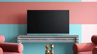
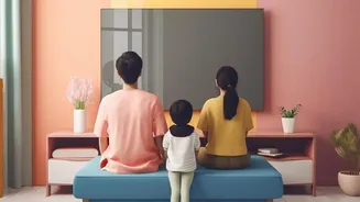
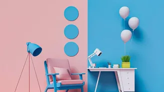
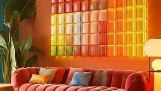
Before we get into its secret weapon, let’s quickly define the star of the show. Colour-blocking is an interior design technique that uses large, solid planes of colour against each other. Think geometric shapes, half-painted walls, or a bold arch behind
a headboard—not fussy patterns or subtle blends. Originating from modern art movements like De Stijl, the goal is to use colour to create structure and visual interest. It's about making a deliberate statement by treating colour itself as the main feature, turning a simple wall into a piece of modern art. When done right, it feels confident and intentional; done wrong, a room can feel busy and chaotic.
Enter the Unsung Hero: Negative Space
Now for the magic ingredient. In art and design, negative space—often called 'white space'—is the empty area around and between the main subjects of an image. If colour-blocking is the collection of bold shapes on your wall, negative space is the unmarked wall surrounding them. It’s the visual ‘breathing room’. Many people feel an instinct to fill every empty spot, but designers know this space isn't truly empty. It's an active and powerful component that helps define the boundaries of the positive space (your colourful shapes) and brings balance to the entire composition.
It Creates Balance and Prevents Chaos
The most important role of negative space is to create harmony. Bold, saturated colours carry a lot of visual weight. Without enough breathing room, multiple bright blocks can compete for attention, making a room feel overwhelming and visually cluttered. Negative space acts as a neutral buffer, giving the eyes a place to rest and reducing what psychologists call 'cognitive load'. This calms the entire composition, allowing each colour block to have its moment without shouting over the others. A simple rule of thumb often used by designers is the 60-30-10 rule: 60% neutral ground (negative space), 30% a primary colour, and 10% an accent. This ratio ensures the design feels balanced rather than lopsided.
Negative Space Directs the Eye
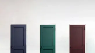
Like a frame around a painting, negative space tells your eyes exactly where to look. The absence of detail or colour in one area naturally pushes your focus towards the areas that do have it. By surrounding your colour-blocked shapes with intentional emptiness, you're essentially creating a spotlight. This makes the colours appear more vibrant and the shapes more defined and dramatic. The contrast between the active, coloured areas and the quiet, negative space is what generates visual excitement. The more breathing room you give an element, the more important it feels to the viewer's eye, strengthening its role as a focal point.
It Adds a Sense of Sophistication
A thoughtfully designed room feels intentional, and the strategic use of negative space is a hallmark of professional design. It signals that every element—including the empty parts—has been considered. While filling a wall with colour is easy, exercising restraint shows confidence and elevates the result from simply painted to thoughtfully designed. Negative space can make a room feel more expansive, airy, and refined. It allows the architectural features of the room and the craftsmanship of your design to shine, giving the space a more high-end, curated feel. In essence, it’s the difference between adding colour to a room and truly designing with it.
How to Use It in Your Own Home
Applying this principle is simpler than it sounds. Your existing wall colour can serve as your negative space, so you don't need to start with a blank canvas. When planning your colour-blocked design, whether it’s a simple rectangle or a more complex series of shapes, step back and consider the composition. Is there enough room around the shapes for them to breathe? Try sketching your idea first, focusing as much on the shapes of the empty spaces as the coloured ones. A good starting point is to ensure the negative space connects and flows, rather than leaving small, trapped pockets of empty wall. This creates a more cohesive and calming effect.