

Understanding the Vintage Colour Vibe
Before you pick up a paintbrush, it’s helpful to understand what makes a colour feel 'vintage'. Generally, vintage palettes fall into a few categories: the earthy, saturated tones of the 1970s, the soft pastels of the 1950s, or the bold neons of the 1980s.
These colours have a deep psychological effect, often evoking feelings of nostalgia, comfort, and joy. Unlike the cool, minimalist greys that have dominated recent trends, vintage colours bring a rich, lived-in quality to a room, telling a story of history and personality. The key is to choose a palette that resonates with you and integrate it thoughtfully into your modern home.
Embrace Earthy, Saturated Hues
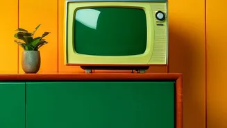
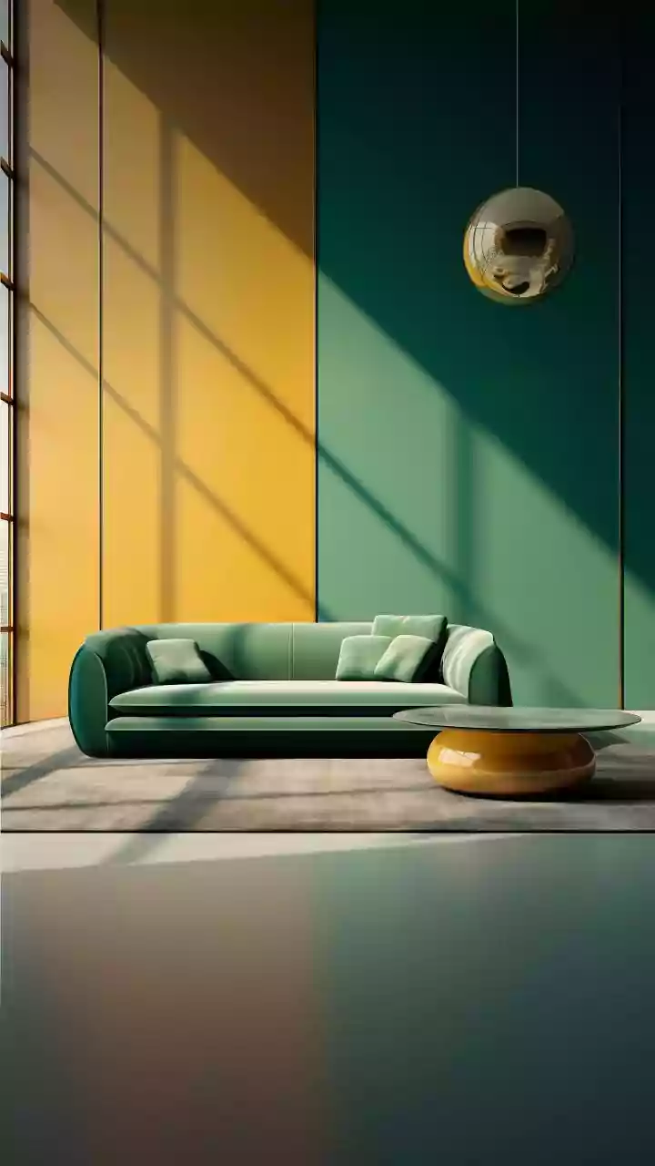
The 1960s and 70s were defined by a love for earthy and deeply saturated colours that felt connected to nature. Think of shades like mustard yellow, burnt orange, avocado green, and rich browns. These colours are perfect for creating a warm and inviting atmosphere, particularly in Indian homes where earthy tones like terracotta and ochre have a long cultural history. Consider a mustard yellow accent wall in the living room to create a cheerful focal point, or use burnt sienna and deep maroon in textiles like cushions and rugs to add warmth without overwhelming the space. These shades pair beautifully with natural wood furniture and brass accents.
Play with Muted Pastels
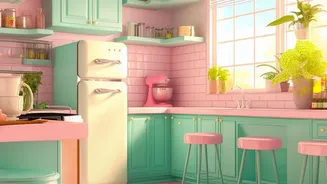
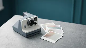
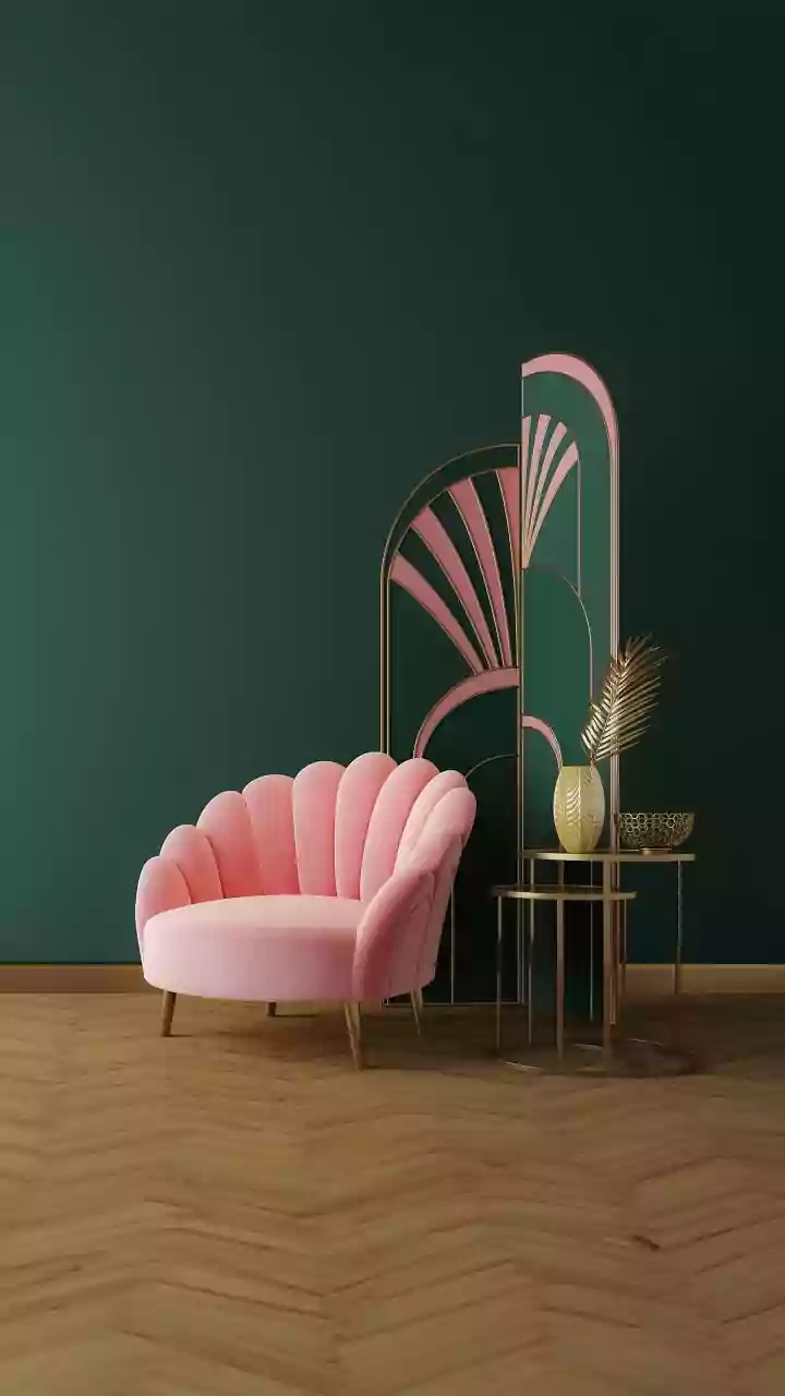
If the bold 70s palette isn't for you, consider the softer side of vintage with dusty rose, mint green, buttercup yellow, and pale blues. These muted pastels were popular in the mid-century and can make a room feel larger and more serene. They work wonderfully in bedrooms and bathrooms, creating a calm, tranquil retreat. In a modern context, you can prevent these colours from looking overly sweet by pairing them with clean, contemporary furniture and neutral tones like a soft white or cream. A mint green kitchen cabinet or a dusty rose armchair can serve as a charming nod to the past.
Start Small with Accent Pieces
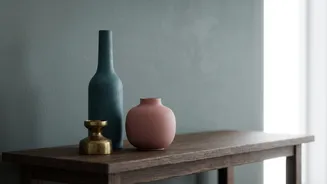
Diving headfirst into a full-room colour change can be intimidating. A great way to experiment with vintage colours is to start small. Introducing colour through accessories is an easy and low-commitment approach. Look for vases, throw pillows, artwork, or even a retro-style rug in shades of olive green, navy blue, or plum. Another effective strategy is to create a single statement piece. Find a vintage-inspired dresser or side table and paint it a bold colour that complements your existing decor. This focal point can set the tone and allow you to gradually build the vintage aesthetic.
Balance is Key: Use Neutrals
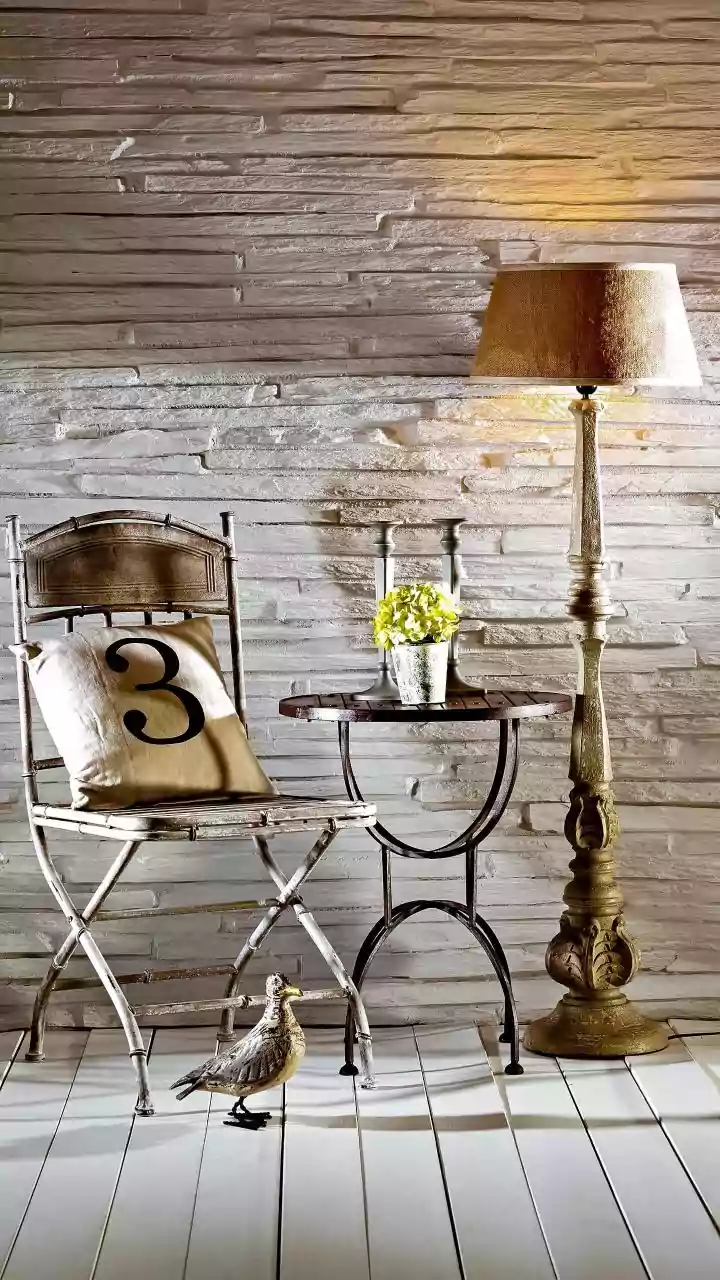
While vintage colours are rich and expressive, they shine brightest when given some room to breathe. The secret to a successful retro-inspired interior is balance. Avoid making your home look like a museum by pairing bold vintage shades with plenty of neutrals. Warm neutrals like beige, cream, and off-white provide a calming backdrop that allows statement colours to pop without creating visual chaos. For instance, if you have a vibrant, patterned wallpaper on one wall, keep the other walls a simple, complementary neutral. This mix of old and new, bold and calm, is what makes the modern vintage style so appealing and liveable.
Incorporate Colour Through Textiles
Paint isn't the only way to introduce a vintage colour scheme. Textiles are a fantastic tool for adding colour, pattern, and texture. Drawing inspiration from Indian textiles like Bandhani with its red and yellow contrasts or Banarasi silks with their jewel tones can add a unique layer to your decor. Think about adding curtains in a bold geometric pattern, a shagpile rug, or velvet cushions in deep, moody colours like emerald green or royal purple. Layering different fabrics can create a sense of depth and history, making the space feel curated over time.