



What Did Musk Actually Propose?
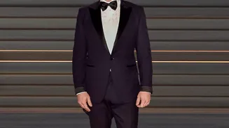
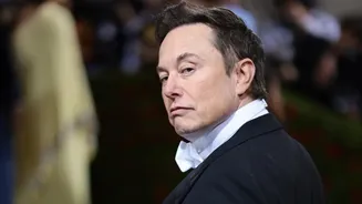
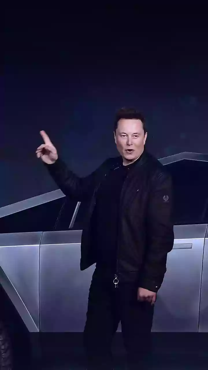
In a recent post on his platform, X, the billionaire took a break from discussing artificial intelligence and space travel to weigh in on a topic close to every writer's heart: the humble dash. Replying to a post, Musk stated, 'The rules of English need
to change to put spaces between the em dashes, as they presently too much resemble a hyphenated word, rather than a parenthetical phrase'. He wasn't finished, adding, 'Also, ‘—’ is an unpleasantly long a line. The en dash, ‘–‘, is a better length'. In essence, Musk finds the longest dash—the em dash—to be too long and wants it to be shorter (the en dash) and always surrounded by spaces for clarity. While it may seem like a trivial point, he waded into one of modern grammar’s most persistent style battles.
A Dash of Grammar: Meet the Three Marks
To understand the debate, you first need to meet the players. The dash family has three main members, each with a specific job. First is the hyphen (-), the shortest of the three. It’s used to join words together, like in 'state-of-the-art' or to split a word at the end of a line. Then there's the en dash (–), which is roughly the width of the letter 'n'. Its main job is to indicate a range, such as 'pages 10–15' or 'the 2024–2025 season'. Finally, we have the em dash (—), the longest of the trio and the subject of Musk's critique. Named because it was traditionally the width of the letter 'M', the em dash is a versatile powerhouse. It’s used to create a dramatic pause, set off an explanatory phrase, or signal an abrupt break in thought—much like I just did.
The Great Style Guide Standoff
Musk's suggestion to add spaces around the dash isn't entirely new; it’s a core difference between the world's leading style guides. The Associated Press (AP) Stylebook, used by most news organisations, specifically calls for a space before and after an em dash. In contrast, The Chicago Manual of Style (CMOS), which is the standard for book publishing and academic writing, insists on no spaces, with the dash connecting directly to the words around it. So, Musk's preference aligns him with journalistic style over literary style. His desire for a shorter 'en dash' to do the job of the longer 'em dash' is a more personal, aesthetic choice, favouring brevity over the traditional, more dramatic mark.
The Case for Digital Simplicity
Why would a tech CEO care about this? Musk's preference can be seen as a reflection of our digital, mobile-first world. On a cramped smartphone keyboard, typing a simple hyphen is easy. Creating a proper en dash or em dash often requires digging through special character menus or memorising obscure shortcuts. Using a simple, shorter dash with spaces is functional and clear on small screens. In a world of tweets, character limits, and rapid-fire messaging, the subtleties of traditional typography can feel cumbersome. The argument is that language and its rules should evolve for modern mediums, prioritising speed and accessibility over historical convention.
In Defence of the Em Dash
For many writers and editors, however, the em dash is a tool of nuance and artistry that shouldn't be discarded. Its history goes back centuries, used by authors from Emily Dickinson to modern novelists to control the rhythm and flow of a sentence. It can add emphasis in a way that parentheses or commas can't, creating a more dramatic, emotional, or conspiratorial tone. To its defenders, replacing it with a shorter dash is like asking a painter to use fewer colours. They argue that while technology changes, the goal of powerful and precise writing remains. Losing tools like the em dash, they claim, risks flattening our written language and sacrificing clarity for mere convenience.