

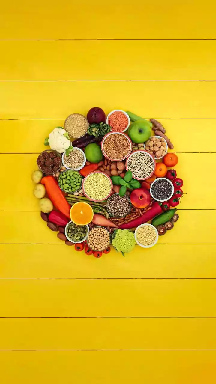




You Eat With Your Eyes First
It is a cliché for a reason: we absolutely eat with our eyes first. Before a single bite is taken, our brains have already made a dozen judgments about what is on the plate. We assess flavour, freshness, and, crucially, healthiness based on visual cues
alone. Recent research confirms this deep-seated instinct, showing that the way food is presented can significantly alter our perception of its nutritional value. In a series of experiments, researchers found that when the same food—from avocado toast to bell peppers—was presented in a neat, orderly, or symmetrical way, people consistently rated it as healthier. This held true even when participants knew the ingredients and calorie counts were identical to their 'ugly' counterparts. This 'pretty equals healthy' bias highlights a powerful, and potentially misleading, cognitive shortcut our minds take when making dietary decisions.
The Allure of 'Classical Aesthetics'
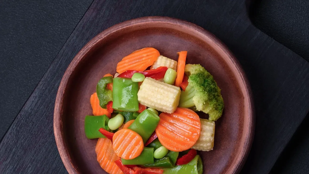
The key to this phenomenon lies in what researchers call 'classical aesthetics'—principles like order, symmetry, and systematic patterns. These visual traits are deeply associated with patterns found in nature, such as the structure of a honeycomb, the scales of a fish, or the petals of a flower. One study from the Journal of Marketing proposes that because our brains link these classical patterns with nature, and we tend to associate 'natural' with 'healthy', the effect spills over onto our food. When a chef artfully arranges slices of apple in a perfect fan or lines up vegetables in a precise pattern, they are tapping into this subconscious bias. The food appears more natural and, therefore, we judge it to be purer, less processed, and lower in calories. Interestingly, this effect doesn't apply to all forms of pretty food. 'Expressively pretty' food, like a sandwich cut into a fun shape, doesn't get the same health boost because it signals creativity rather than naturalness.
The Order and Texture Effect
Neatness counts for a lot. Studies have shown that simply arranging food tidily on a plate, compared to a messy presentation, increases how much people like it and how healthy they think it is. This may be tied to an 'effort heuristic'. Our brains may subconsciously assume that if someone took the time and care to present food beautifully, they probably also took care to use good, healthy ingredients. Beyond arrangement, even the surface of the food itself sends signals. Research from Anglia Ruskin University found that oat biscuits with a more pronounced, explicit texture were perceived as healthier by participants. Conversely, biscuits with a smoother surface were seen as tastier and more indulgent, highlighting a common belief that 'tasty' and 'healthy' are often at odds. Food manufacturers can use these visual cues to their advantage, designing textures that signal health to appeal to wellness-focused consumers, or smoother textures to emphasize taste.
The Modern Consumer's Challenge
This psychological quirk has significant implications in our modern food environment. We are bombarded with almost 7,000 food ads annually, many of which use expert food stylists to make products look irresistibly perfect. That flawlessly constructed burger or perfectly round pizza in an advertisement is designed to do more than just make you hungry; it is also subtly convincing you of its quality and, on some level, its wholesomeness. As consumers, we are often making snap judgments in grocery aisles and restaurants. The 'pretty equals healthy' bias can lead us to overestimate the nutritional value of a beautifully presented, yet calorie-dense, dessert or choose a processed snack simply because its packaging and form look clean and orderly. Researchers have even found that people are willing to pay more for prettier food because they perceive it to be healthier. This can make navigating food choices even more challenging, as marketing tactics exploit our brain's natural tendencies.