





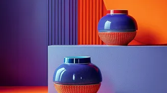
What Exactly Is Colour-Blocking?
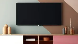
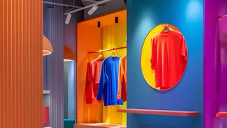
First seen making waves in the fashion world, colour-blocking has since become a powerful tool in interior design. The technique involves using distinct, solid blocks of two or more colours, often in contrasting or complementary shades, to create a bold
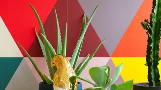
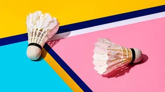
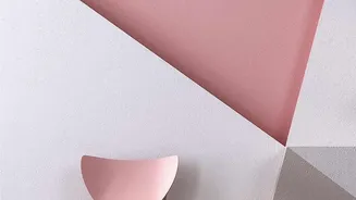
visual statement. Think of it as painting with shapes. Instead of intricate patterns, the focus is on the clean lines and the interplay between solid fields of colour. This concept can be applied to walls, furniture, and textiles, but it finds a particularly accessible and high-impact home in the world of wall art. From minimalist geometric prints to large abstract canvases, colour-blocked art uses this principle to bring a structured yet vibrant energy into a space.
The Secret to Palette Balance: The 60-30-10 Rule
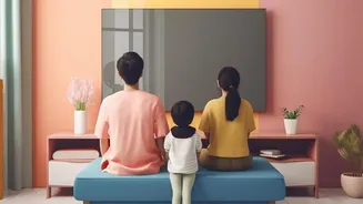
To understand why colour-blocked art is so effective, it helps to know a classic designer's trick: the 60-30-10 rule. This principle suggests that for a balanced room, 60% of the space should be a dominant colour (usually walls), 30% should be a secondary colour (furniture, curtains), and 10% should be an accent colour (cushions, decor, and art). That final 10% is where the magic happens, and it's often the hardest part to get right. It needs to be punchy enough to add personality but not so overwhelming that it creates visual chaos. This is where a single piece of artwork can be a powerful problem-solver.
How Art Can Tie Your Room Together
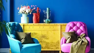
A piece of colour-blocked wall art can act as the perfect anchor for your room’s entire colour scheme. It can serve multiple functions in achieving that coveted palette balance. If your room is mostly neutral, a vibrant colour-blocked piece can single-handedly introduce both your secondary (30%) and accent (10%) colours in one go. Alternatively, if you already have furniture and textiles in various shades, the right artwork can act as a visual bridge, featuring hues from each element to create a sense of harmony. By containing your key colours within a single, defined frame, the art makes the palette feel intentional and curated rather than accidental.
Choosing the Right Colour-Blocked Piece
When selecting art, first identify the dominant colours already present in your room. Do you want a piece that introduces a bold, contrasting colour, or one that features different tones of your existing palette for a more monochromatic look? Consider scale as well. A large, dramatic canvas can serve as the main focal point above a sofa or bed. A series of smaller, related geometric prints can create a balanced gallery wall, repeating your accent colours to guide the eye around the room. Don't be afraid to choose art with bold, abstract shapes; the simplicity of colour-blocking ensures it feels modern and artistic, not chaotic.
More Than Just a Canvas
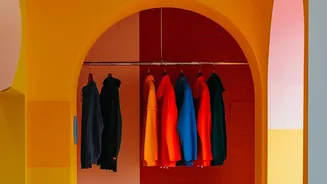
Embracing colour-blocking on your walls doesn't have to stop at framed art. For a more integrated look, consider painting geometric shapes or a split-wall effect directly onto the wall to create a feature. You could paint an arch to define a reading nook or a bold stripe to create the illusion of a higher ceiling. These painted elements can then be your guide for choosing other accents in the room. This approach turns the wall itself into a work of art and makes the colour palette feel deeply embedded in the architecture of the space, offering a custom look that is both sophisticated and playful.