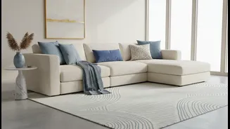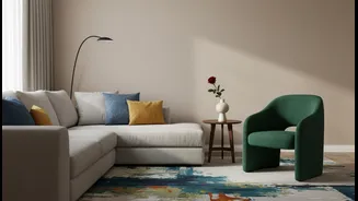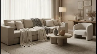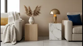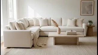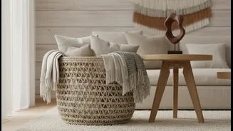




First, What Are Warm Neutrals?
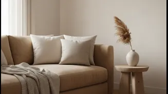
Before diving into pairings, let's define our base. Warm neutrals are the cosy, inviting colours that form the foundation of many comfortable homes. Think of shades like beige, cream, taupe, and even some warmer off-whites. What makes them "warm" is their
connection to the warmer side of the colour wheel. They have subtle undercurrents—or undertones—of red, yellow, or orange. These undertones are what give a creamy white its sunny disposition or a beige its earthy, welcoming feel, creating an atmosphere that feels intimate and energetic.
The Secret Language of Undertones
The headline's claim hinges entirely on undertones. An undertone is the subtle, underlying colour that influences the main, visible hue. For instance, two beige paints can look very different side-by-side because one might have a yellow undertone while the other has a pinkish-red one. The key to a truly cohesive and professional-looking colour scheme is to create harmony between these undertones. When the undertone of your neutral base (like your walls or sofa) aligns with the undertone of your accent colour (your cushions, art, or throws), the whole look clicks into place. It creates a layered, intentional feeling rather than a collection of random items.
How to Identify the Undertone
Identifying undertones can be tricky, as they're meant to be subtle. The easiest trick is to use a comparison. Place your neutral item—be it a paint swatch or fabric sample—next to something pure white. Against the starkness of pure white, the underlying yellow, pink, or peachy tones in your neutral will become much more apparent. Lighting is also a major factor. Natural daylight, especially the golden light of the late afternoon, will bring out the warmth in a colour. In contrast, cool northern light might mute them. Always test colours in the room where they will live to see how they behave throughout the day.
Perfect Pairing: Earthy and Rich
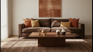
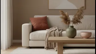
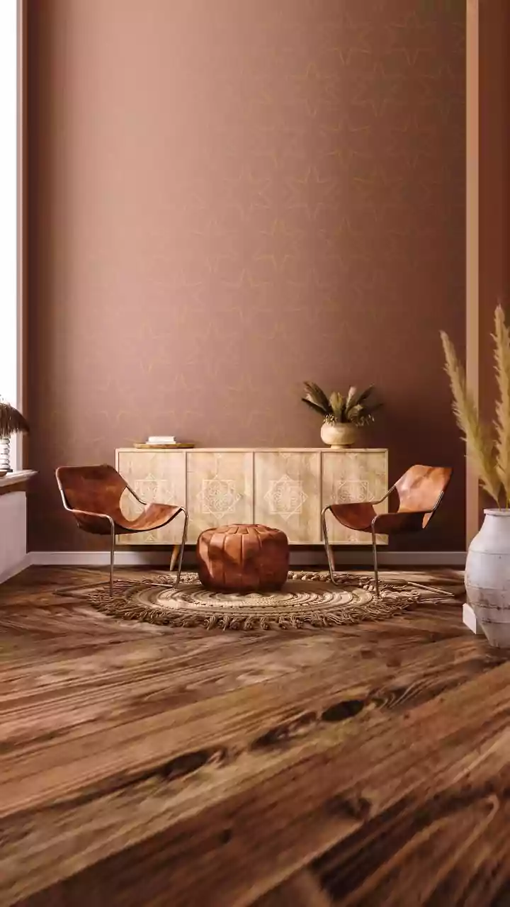
Since many warm neutrals have yellow or red undertones, they pair beautifully with accent colours from the same family. Think of terracotta, rust, and burnt sienna. These colours share the same foundational warmth. A rich terracotta pot or a deep rust-coloured throw blanket against a creamy beige wall feels natural and grounded. This combination works because the colours aren't fighting for attention; instead, they're complementing each other. This palette is perfect for creating a space that feels earthy, inviting, and effortlessly chic.
Perfect Pairing: Golden and Green
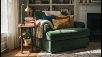
For neutrals with a strong yellow or golden-beige undertone, leaning into that warmth is a foolproof strategy. Mustard and ochre are spectacular choices. A mustard yellow armchair or a few strategically placed ochre cushions can inject energy and personality into a neutral room without creating a jarring contrast. Similarly, warm greens like olive and moss are excellent partners. These greens often contain a hint of yellow themselves, making them a natural extension of the warm neutral base. This creates a palette inspired by nature that is both calming and sophisticated.
Can You Use Cool Accents?
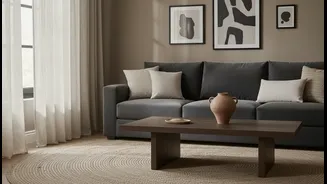
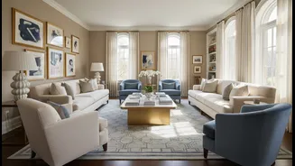
So, does this mean you can never pair a cool blue with a warm beige? Not at all—but it creates a very different effect. Pairing warm neutrals with cool accents (colours with blue, green, or purple undertones) is a deliberate choice for creating high contrast and drama. A sharp navy blue against a soft beige can be stunning, but the goal is tension and balance rather than harmony. For a seamless, enveloping, and cosy feel, the most reliable advice is to stick with accents that share the same warm undertone as your neutral foundation. It’s the simplest path to a palette that feels both comforting and complete.