









Beyond Beige: The Myth of a Simple Neutral
First, we must dispel the myth that a neutral colour is without complexity. A beige is never just beige, a grey is never just grey, and a white is certainly never just white. Every neutral shade has a subtle colour hiding beneath its surface—a whisper
of yellow, a hint of blue, a touch of pink. This is its undertone. Understanding this is the first step to mastering a cohesive colour palette. When these underlying colours are not in harmony, the room can feel slightly 'off' or disjointed, even if you can't quite put your finger on why. Conversely, when you align them, you create a sophisticated, layered look that feels intentional and deeply comforting.
Warm vs. Cool: Decoding the Undertones
Undertones are generally sorted into two families: warm and cool. Warm undertones are derived from reds, oranges, and yellows. Think of creamy off-whites, beiges with a golden glow, or 'greige' (grey-beige) that leans more towards tan. These colours are known for creating a welcoming and intimate atmosphere, making them popular choices for living rooms and spaces where you want to encourage gathering. Cool undertones come from blues, greens, and purples. These include crisp whites, steely greys with a blue cast, and taupes that feel more like stone than sand. Cool tones evoke a sense of calm and are often used to make smaller spaces feel more expansive.
How to Spot the Hidden Colour
Identifying undertones can feel like a professional secret, but there are simple tricks. The easiest method is comparison. Never look at a single colour swatch in isolation. When you place a paint chip next to a piece of pure white paper, its underlying hue often becomes immediately obvious. Another reliable method, especially for lighter neutrals, is to look at the darkest colour on the same paint strip. That deep shade will reveal the swatch family's true colour base, whether it's a hint of green, red, or violet. Finally, always test paint samples in the room itself. Move the samples around throughout the day to see how they react to different light, which can dramatically change how an undertone presents itself.
Building a Cosy, Warm-Toned Palette
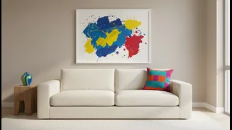
To create that sought-after cosy feeling, lean into a consistently warm palette. This doesn't mean everything has to be the same shade. The beauty is in the layering. Start with a foundational wall colour, perhaps a creamy white with a yellow undertone or a soft, warm greige. Then, layer in other neutrals from the same warm family. Think furniture in a rich oatmeal fabric, a rug in a deeper mushroom or taupe, and wooden elements with warm, golden, or reddish finishes like cherry or mahogany. Accents in materials like brass, copper, or bronze will further enhance these warm tones and make the entire space feel cohesive and enveloping.
The Case for a 'Cool and Cosy' Room
While warm tones are a natural fit for cosiness, a cool-toned room can also achieve a snug and inviting feel. The key, once again, is consistency and texture. A room featuring various greys that all share a subtle blue or green undertone can feel incredibly serene and sophisticated. To prevent it from feeling sterile, you must introduce a heavy dose of texture. Imagine a charcoal grey sofa in a soft, nubby fabric, layered with chunky knit wool throws, velvet cushions, and a plush rug underfoot. The consistency of the cool undertones provides the calm, while the variety of textures provides the comfort and warmth the eye craves. This approach works especially well in rooms with lots of warm, natural sunlight, as the cool tones help balance the light.