


Embrace Mid-Century Earth Tones
The Mid-Century Modern (MCM) period, spanning from the 1930s to the mid-1960s, is defined by its connection to nature and a sense of optimism. The colour palette reflects this with a foundation of warm, earthy hues. Think of shades like terracotta, mustard
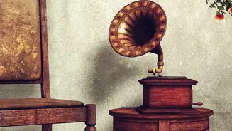
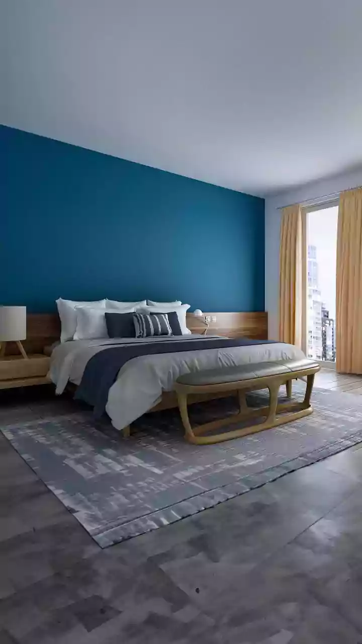
yellow, olive green, and deep teal. These colours are saturated but grounded, avoiding the brightness of primary colours. A key element of this style is pairing these painted tones with natural wood, especially teak and walnut, which are considered part of the colour scheme itself. To bring this look home, consider a mustard yellow accent chair or an olive green feature wall. Pair these with warm neutrals like cream or oatmeal to keep the look balanced and prevent it from feeling dated.
Channel Art Deco Opulence
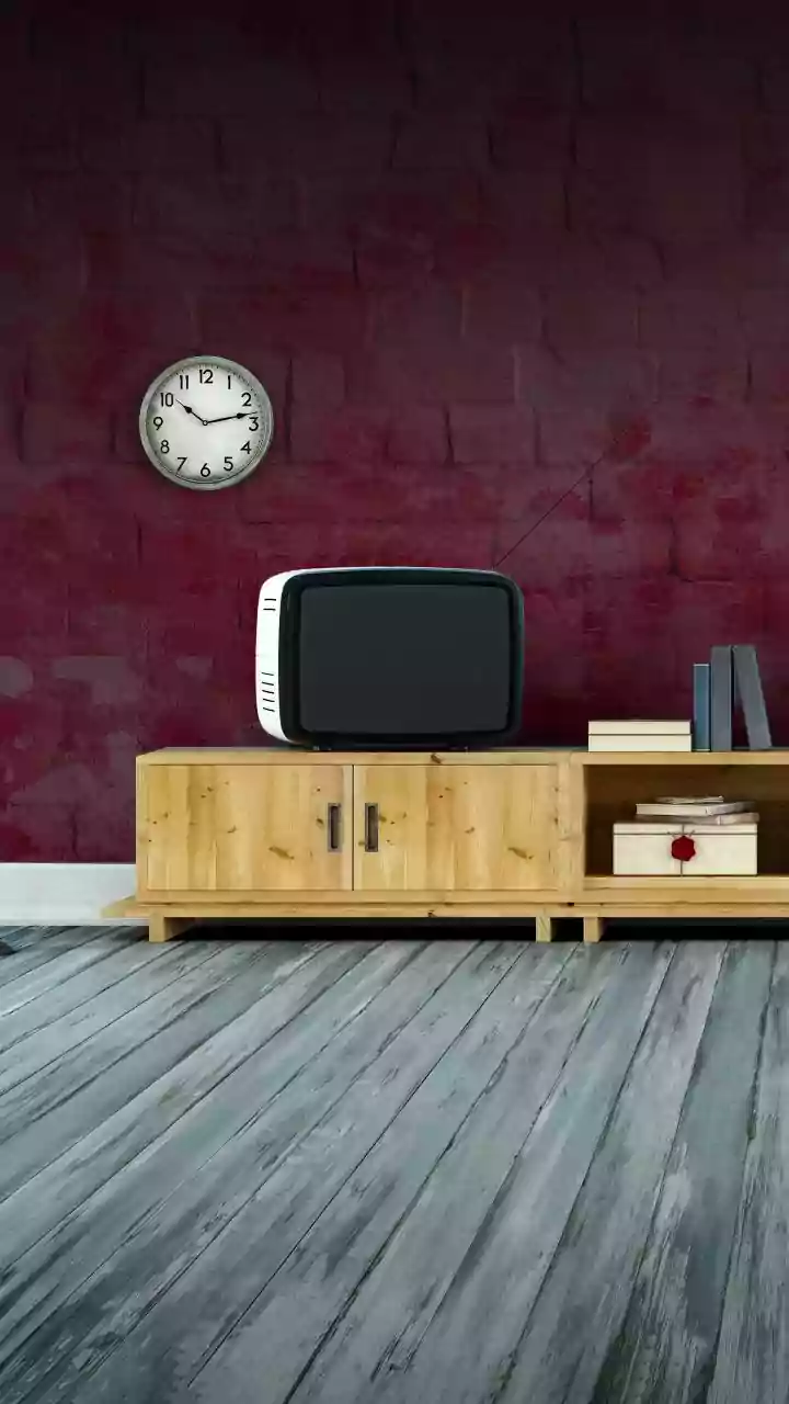
For a touch of glamour, look to the Art Deco era of the 1920s and '30s. This style is all about luxury, sophistication, and bold statements. The colour palette is rich and dramatic, built on deep jewel tones. Think emerald green, sapphire blue, rich burgundy, and even striking black. These luxurious shades are almost always paired with high-shine metallic accents like gold, brass, or chrome, which adds to the opulent feel. You can introduce this palette in a big way with a velvet sofa in a deep blue or green, or start smaller with lacquered side tables, geometric-patterned cushions, or metallic light fixtures. To keep it modern, balance these deep colours with softer neutrals like cream or beige.
Go Groovy with a '70s Palette
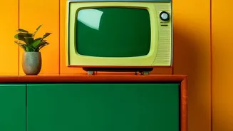
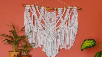
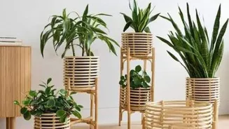
The 1970s are making a major comeback in interior design, but with a modern twist. This era was known for its warm, earthy, and sometimes funky colour combinations. Iconic shades include burnt orange, avocado green, harvest gold, and rich chocolate brown. Today’s interpretation of this trend involves using these colours more intentionally. Instead of covering an entire room in shag carpet, use these bold hues as statement accents. A burnt orange sofa, rust-coloured throw pillows, or avocado green kitchen cabinets can add a playful, nostalgic vibe. These colours pair beautifully with natural textures like rattan, wicker, and dark wood paneling, all hallmarks of '70s decor.
Soften Up with Dusty Pastels
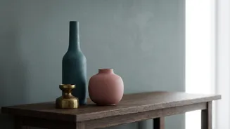
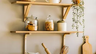
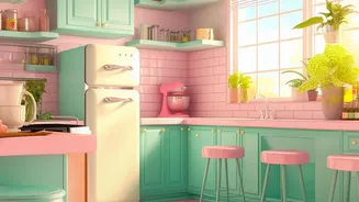
Vintage doesn't always have to be bold. Softer, more romantic eras utilized muted and dusty pastels that can create a calming and elegant atmosphere. Think of colours like dusty rose, sage green, and faded teal. These shades have a desaturated quality, as if they have gently faded over time, giving them a sophisticated and timeless feel. This palette is perfect for creating a serene bedroom or a gentle living space. A 'grandmacore' aesthetic, which blends vintage floral patterns and heirlooms, often uses these soft, nature-inspired colours like buttery yellows and sage greens to ground the space. They work beautifully with creamy whites and light wood tones for a light, airy, and subtly nostalgic look.
Start Small with Accents and Textiles
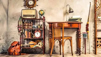
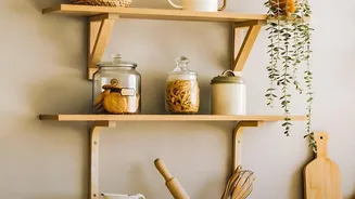
If painting an entire wall feels too daunting, you can easily introduce a vintage colour palette through accessories and textiles. This is a low-commitment way to experiment with the trend and see what you like. Look for cushions, throw blankets, and area rugs in classic retro patterns like chevrons or simple geometrics. Thrift stores can be a great source for unique decor items like coloured glass vases, retro lamps, or vintage-style artwork that can serve as a colour focal point. By starting with smaller items, you can layer colours and textures gradually, ensuring the final look feels curated and personal rather than overwhelming.
Balance is Key
The secret to successfully using vintage colours without making your home look like a time capsule is balance. It's important to mix old with new. A good rule of thumb is to stick to a cohesive colour story, starting with a neutral base on your larger surfaces like walls and sofas. Then, layer in your chosen vintage shades as accents. For instance, pair a bold, retro-coloured piece of furniture with clean, modern decor. This contrast keeps the vintage elements from feeling fussy and makes them look more intentional. By pairing nostalgic hues with fresh neutrals or even an unexpected modern pop of colour, you bring them firmly into the present day.