






A Dash of Punctuation Confusion
Before diving into the debate, let's clarify what an em dash even is. It’s the longest of the three horizontal lines used in writing—longer than both the hyphen and the en dash. The hyphen (-) is the shortest, used to join words together, like 'state-of-the-art'.
The en dash (–) is slightly longer and typically indicates a range, like 'pages 10–15'. The em dash (—), named because it was traditionally the width of a capital letter 'M', is the most versatile of the three. It's used to create a pause, set off a parenthetical thought, or add emphasis. Think of it as a more dramatic comma or a less formal colon. It can signal an interruption or a sudden shift in thought, making it a powerful tool for writers aiming for a conversational tone.
The Readability Question
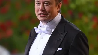
In a recent post on X, Elon Musk suggested that the rules of English should change. He argued that the em dash is 'unpleasantly long' and that its lack of surrounding spaces makes it look too much like a hyphenated word, potentially confusing readers. He proposed that the shorter en dash is a 'better length' and that spaces should be added around dashes used for parenthetical phrases. So, is he right? From a user experience (UX) and typography perspective, readability is paramount. Experts focus on factors like font size, contrast, and line length to ensure text is easy to scan and understand. While some style guides, particularly in American English, call for no spaces around an em dash, British style often prefers a spaced en dash for the same purpose. Some typographers agree that a long, unspaced em dash can disrupt the visual texture of a text block. However, others find it an elegant and expressive tool that adds a unique rhythm to prose. There is no universal consensus, but the goal is always clarity, and overuse of any punctuation can hinder it.
The Cult of the Founder
This seemingly minor punctuation debate is more than just a grammatical squabble; it's a perfect example of the 'cult of the founder' in the tech world. When the head of a massive social platform like X voices a personal preference, it carries the weight of potential policy. Musk's musings on everything from content moderation to typography can directly influence the user experience for hundreds of millions of people. This isn't new, as tech leaders have long imprinted their personal philosophies onto their products. This dynamic means that design and functionality choices are not always the result of extensive user research or expert consensus. Sometimes, they simply reflect the whims of the person at the top. The discussion around the em dash, therefore, becomes a case study in how top-down, personality-driven decisions shape our digital environments, for better or worse.
Punctuation and Platform Identity
The em dash has recently found itself in the middle of another cultural conversation: its association with AI-generated text. Language models like ChatGPT have been observed to use em dashes frequently, leading some to view the punctuation mark with suspicion as a sign of non-human writing. By wading into this, Musk is touching on a live issue in digital communication. His preference for the en dash could be interpreted as a move to make text on X feel more direct or less stylistically complex. Whether this is a genuine attempt to improve readability or simply a matter of personal taste, it highlights how even the smallest details contribute to a platform's identity. In an age where authenticity is highly valued, the very punctuation we use has become loaded with meaning, signaling everything from stylistic flair to the potential presence of an AI.