
Understanding Vintage Palettes
First, it's important to remember that 'vintage' isn't a single style; it spans several distinct eras, each with its own colour identity. The Art Deco period of the 1920s and 30s favoured strong, dramatic colours like deep blues and blacks, often accented
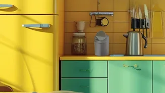
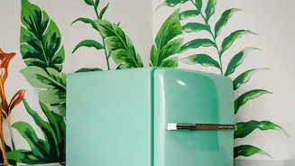
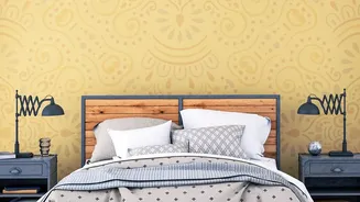
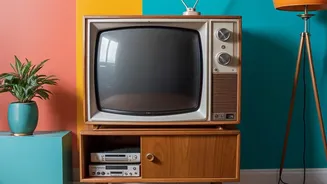
with metallics. The 1950s ushered in a wave of optimism with playful pastels like mint green, dusty rose, and buttery yellow. The 60s and 70s swung towards earthy, saturated tones, making mustard yellow, avocado green, and burnt orange the stars of the show. Understanding which era you're drawn to is the first step in building a cohesive and intentional palette.
The Foundation: Muted and Earthy Tones
The secret to a sophisticated vintage look often lies not in the brightest colours, but in the most subdued. Many classic palettes are built on a foundation of muted, earthy, and desaturated shades. These colours, like olive green, dusty blue, and terracotta, have a softness to them that suggests age and history. They feel lived-in and comfortable, rather than sharp and new. Using these toned-down colours as your base creates a calming backdrop that prevents the space from feeling overwhelming or kitschy, which can be a risk when dealing with strong retro palettes. Think of these as your main colours, setting the overall mood of the room.
The 60-30-10 Rule for Vintage Harmony
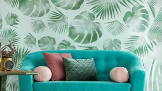
A classic interior design principle, the 60-30-10 rule, is your best friend for achieving balance. This guideline suggests your room should be 60% a dominant colour, 30% a secondary colour, and 10% an accent colour. In a vintage context, your 60% is likely that muted, foundational shade on the walls and perhaps a large piece of furniture like a sofa. The 30%, or secondary colour, can be another, slightly more prominent vintage hue used on curtains, side chairs, or an accent wall. This colour should support the main hue but provide interest. The final 10% is where you have fun. This is your 'pop' of colour—a vibrant mustard yellow, a bold teal, or a rich burnt orange—used sparingly in throw pillows, artwork, or decorative objects. This formula ensures colour is distributed in a way that feels balanced and intentional.
The Unsung Hero: Warm Neutrals
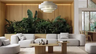
Amidst the rich and often quirky colours of vintage palettes, the role of neutrals is crucial. Warm neutrals like cream, beige, taupe, and even soft grey act as a canvas, allowing your chosen vintage colours to shine without competing. A neutral foundation on walls or large furniture pieces can make a room feel fresh and modern, even when filled with vintage-style accents. They provide visual breathing room, preventing a space packed with avocado green and harvest gold from feeling heavy or dated. Pairing your vintage hues with these grounding neutrals is essential for achieving a look that nods to the past while feeling perfectly at home in the present.
Bringing It All Together with Texture
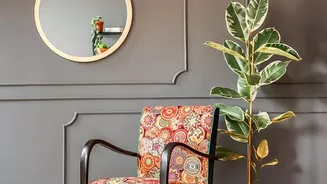
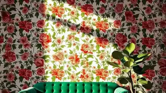
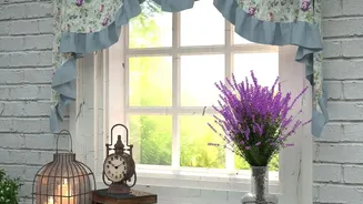
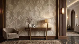
Colour doesn't exist in a vacuum. The final layer of a successful vintage-inspired room is texture and pattern, which work in tandem with your colour choices. The tones in wood furniture, like walnut or teak from the mid-century era, contribute to the overall warmth of the palette. Metallic finishes such as brass and gold add a touch of period-appropriate glamour. Furthermore, introducing patterns through wallpaper or textiles can reinforce your theme. A floral chintz speaks to a rustic, romantic vintage feel, while a bold geometric pattern aligns more with Art Deco or 70s styles. Balancing these elements with your colour scheme creates a rich, layered look that feels authentic and thoughtfully assembled.