

The Foundation: Understanding Colour Blocking
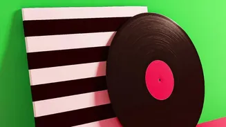
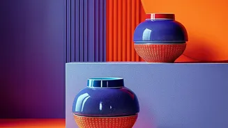
First, let's revisit the core concept. Colour blocking is the practice of pairing two or more solid blocks of colour to create a bold, graphic statement. Originating in the world of fashion and inspired by artists like Piet Mondrian, this trend made its
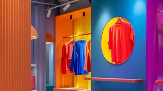
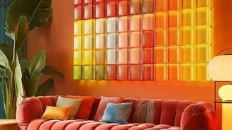
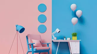
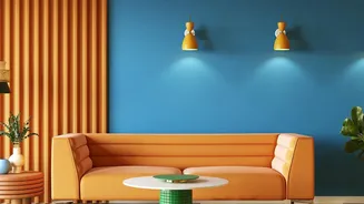
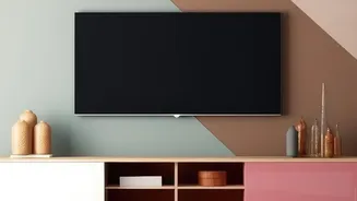
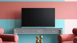
way into interior design as a dynamic way to define spaces. It can be as simple as painting two adjoining walls in different hues, or creating geometric shapes on a single wall. The goal is to let large fields of solid colour do the talking, creating structure and rhythm in a room without needing busy patterns. Done well, it feels confident and intentional; done without care, it can make a room feel chaotic.
The Secret Weapon: The Power of Negative Space
Negative space is the unsung hero of good design. It refers to the empty or unoccupied areas around and between the objects in a room—or in this case, the shapes on your wall. Think of it as visual breathing room. Far from being wasted space, these empty areas help create balance, prevent a room from feeling cluttered, and allow the eye to rest. This intentional emptiness is what makes key elements stand out. In luxury design, less is often more because negative space allows materials and forms to be truly appreciated. It’s the pause in a conversation that gives the words more meaning. By resisting the urge to fill every inch, you bring the positive elements—your blocks of colour—into sharper focus.
A Perfect Pairing: Why It Works So Well
When you combine bold colour blocking with thoughtful negative space, the result is magic. The negative space—often the original wall colour itself—acts as a frame and a buffer. It stops vibrant hues from visually clashing and overwhelming the senses. Instead of a wall screaming with colour, you get a curated, artistic composition. The empty space gives your colour blocks definition, making their shapes appear more deliberate and graphic. This technique guides the viewer's eye, creating movement and highlighting the shapes you've created. It turns a simple paint job into something that feels like a custom mural or a large-scale piece of art. The contrast makes each element pop, achieving a high-impact look that still feels airy and sophisticated.
How to Get the Look: Simple and Creative Ideas
Incorporating this concept is easier than it sounds and can be adapted to any style or skill level. A great starting point is to use your existing wall colour as the negative space. Instead of painting a whole wall, paint large geometric shapes—like circles, arches, or asymmetric blocks—and let the original wall colour show between them. This creates the impression of floating forms. You can paint a half-wall, leaving the top half blank to create a sense of height, or paint a large block of colour behind a gallery wall to unify the display. Asymmetrical layouts often feel more dynamic and modern than perfect symmetry. Plan your design by using painter's tape to outline your shapes before you commit. This allows you to step back and assess the balance between colour and empty space.
Choosing Your Colours with Confidence
The beauty of using negative space is that it allows you to be braver with your colour choices. When a bold colour is contained within a defined shape and surrounded by a neutral buffer, it becomes a feature rather than a flood. You can experiment with vibrant, saturated tones that you might otherwise shy away from. A good rule of thumb is to stick to two or three colours plus a neutral (your negative space) to maintain a cohesive look. Consider the mood you want to create; warm colours like terracotta can feel cosy, while cool blues can be calming. Hold paint swatches up against your wall to see how they interact with the light and the existing neutral tone before you start painting.