





What Is Colour Blocking?
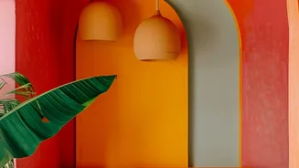
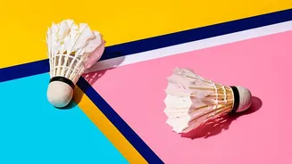
At its core, colour blocking is the art of pairing two or more solid blocks of colour next to each other. In interior design, this translates to using discrete, solid planes of colour to create visual structure in a room. Think of a single, bold yellow
arch painted behind a headboard, a two-toned wall split horizontally, or a large canvas with intersecting fields of navy and blush pink. The key is that the colours have clear boundaries rather than blending or forming a pattern. This technique has roots in early 20th-century art movements like De Stijl, where artists like Piet Mondrian proved that a few flat, saturated colours arranged with intention could carry immense visual weight. The concept was famously adapted for fashion by Yves Saint Laurent in his 1965 Mondrian collection, and the logic transfers perfectly to our homes: a wall can be a canvas just like a dress.
The Power of Shape and Shade
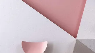
Geometric colour blocking isn’t just about making a room more vibrant; it’s a powerful tool for shaping perception. Vertical stripes or tall, rectangular blocks can create the illusion of higher ceilings, making a room feel more spacious. Horizontal bands, on the other hand, can make a narrow room feel wider. Beyond structural tricks, the shapes and colours themselves influence the room's atmosphere. The psychology of colour plays a huge role; blues and greens can feel calming, while yellows and oranges are energizing. You can use colour blocking to define a specific zone in an open-plan space, like creating a colourful nook for a home office or a reading corner. A painted arch can glamorously frame a vanity, while a bold circle can act as a playful focal point in a child's room. This technique turns your wall into an architectural feature.
Finding Your Perfect Palette
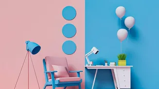
Choosing the right colours is the most crucial step. A good rule of thumb is to stick to two or three colours plus a neutral to avoid the design looking chaotic rather than curated. Designers often use the 60-30-10 rule: 60% of your room is a dominant neutral colour, 30% is your primary block colour, and 10% is a smaller accent. For a high-impact look, choose complementary colours that sit opposite each other on the colour wheel, like blue and orange or purple and yellow. This creates a vibrant, energetic feel. For a softer, more harmonious effect, an analogous scheme using colours that are next to each other on the colour wheel (like blue and green) works beautifully. You could also try a monochromatic approach, using different tones of the same colour family for a subtle and sophisticated look.
Paint vs. Prints: Two Paths to Style
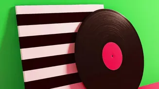
There are two main ways to bring geometric colour blocking into your home: painting directly onto the wall or using wall art. Painting is a budget-friendly and high-impact option that allows for complete customization of shape, size, and colour. With a roll of good-quality painter's tape, a level, and some patience, you can create sharp, professional-looking geometric designs. This method is perfect for creating accent walls, faux headboards, or architectural features like arches. If you're less confident in your DIY skills or prefer a less permanent solution, framed art prints, canvases, and decals are excellent alternatives. Large canvases featuring bold, minimalist colour blocks can serve as a stunning focal point over a sofa or dining table. This approach allows you to experiment with the trend and easily swap out pieces as your style evolves.
Tips for Flawless Execution
To ensure your colour blocking project looks intentional and polished, planning is key. Start by sketching your design and testing your paint colours. When painting, preparation is everything: clean your walls thoroughly and use high-quality painter's tape for crisp, clean lines. To avoid paint bleeding under the tape, apply your first coat of paint just over the edge of the tape. When it's time to remove the tape, some experts suggest doing it when the paint is still slightly tacky, while others recommend waiting until it's fully dry if you've used high-quality tape. Regardless of your method, pulling it off slowly is crucial. If you're using artwork, consider the 1-accent rule: pick one accent colour from the art and repeat it in small doses around the room—through cushions, a vase, or books—to create a cohesive look.