


Beyond the Accent Wall
Colour-blocking is an interior design technique where you use two or more solid blocks of colour next to each other. Unlike a simple accent wall, which covers a single surface, colour-blocking uses geometric shapes—arcs, circles, rectangles—to create
a more deliberate and artistic composition on your walls. The goal is to turn your wall into a canvas, using fields of colour to define zones, create a focal point, or simply inject personality into a room. It’s a method that is less about random decoration and more about creating structure and visual rhythm with colour itself. The result is a space that feels intentional, confident, and thoughtfully designed.
The Psychology of Your Palette
The colours you choose are the foundation of your room's emotional landscape. Colour psychology suggests that different hues can profoundly impact our mood and energy levels. Warm colours like terracotta, yellows, and oranges tend to feel energetic and inviting, making a space feel cosier and more sociable. They are often great for living rooms or dining areas. In contrast, cool colours like blues, greens, and soft lavenders recede visually, creating a sense of calm and spaciousness. These shades are ideal for bedrooms and home offices where relaxation and focus are desired. By understanding these associations, you can select a palette that actively supports the intended function and feeling of your room.
The Silent Language of Shapes
Just as colours have psychological weight, so do shapes. Geometric art is built on a universal language that our brains instinctively process. Shapes with straight lines and sharp angles, like squares and rectangles, often symbolise stability, structure, and order. They can make a room feel grounded and balanced. Curved shapes, such as circles and arches, represent continuity, softness, and connection. They can introduce a sense of gentle movement and playfulness. Triangles can add a dynamic energy, pointing the eye and creating a sense of direction. When you paint a large arch behind your bed or a series of rectangles in your study, you are using this silent language to reinforce the room's atmosphere.
Creating Harmony with Combinations
The true art of colour-blocking lies in combining colours effectively. A helpful guideline for any room is the 60-30-10 rule: 60% of your space is a dominant colour (like your main wall colour), 30% is a secondary colour, and 10% is a small pop of an accent colour. This creates a balanced look. For high impact, you can use complementary colours, which sit opposite each other on the colour wheel (like blue and orange), creating a vibrant, energetic feel. For a more subtle and calming effect, an analogous scheme uses colours that are next to each other on the wheel (like blue and green). Another approach is a monochromatic palette, using different tones of the same colour to create depth without overwhelming the senses.
Paint vs. Framed Art: Choosing Your Medium
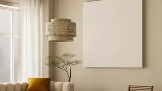
You can achieve a colour-blocked look in two main ways: painting directly onto the wall or using large, framed artworks. Painting offers a seamless, architectural feel, making the design an integral part of the room. It’s perfect for creating zones, like a painted arch to frame a desk area, or for highlighting architectural details. Framed art, on the other hand, offers more flexibility. It allows you to introduce bold, geometric compositions without the commitment of paint. This is an excellent option for renters or for those who like to change their decor frequently. Both methods are valid expressions of the style; the choice depends on your desired level of permanence and your willingness to DIY.