






The Eyes Always Take the First Bite
Before a single morsel touches our lips, our eyes have already conducted a full-scale analysis. This initial visual assessment is a powerful, hardwired instinct that sets our expectations for flavour, quality, and even nutritional value. A beautifully
presented dish, with its components carefully arranged, signals care and professionalism. In contrast, a messy or disorganised plate can suggest the opposite, even if the ingredients are identical. Studies have long recognised this deep connection between what we see and what we taste. Researchers call this phenomenon 'visual priming', where an attractive appearance creates a positive sensory expectation in our brain, which can genuinely enhance how we perceive the food's flavour and freshness once we eat it. It’s a silent but powerful force that shapes our entire dining experience.
The Psychology of a Pretty Plate
So, what exactly is happening in our minds? It turns out that our brains are constantly looking for shortcuts or heuristics to make quick judgments. When it comes to food, certain visual cues are automatically associated with positive attributes like freshness, naturalness, and health. One study found that people rated the very same meal as more enjoyable and liked its individual components—like chicken and rice—significantly more when it was plated in an attractive, organised manner versus a less neat presentation. Interestingly, this bias extends to how healthy we think a food is. Research has shown that people judge identical foods as healthier when they look pretty, in part because they also perceive them as more 'natural'. This suggests that our brains equate aesthetic qualities like order, balance, and symmetry with the inherent goodness of the food.
The Powerful Influence of Colour
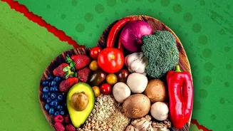
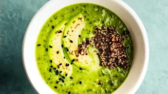
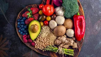
Colour is arguably the most immediate and influential visual cue. Our ancestors relied on colour to survive, learning that vibrant, colourful fruits and vegetables were often the most nutritious. That instinct remains with us today. Bright, natural colours like fresh greens, deep reds, and sunny yellows signal freshness and quality, while dull, monotone food can seem unappetising. This isn't just an assumption; there's a reason we prefer bright orange carrots, as the colour indicates they are ripe and loaded with beta-carotene. The association is so strong that colour can even influence our perception of taste and flavour. Studies have confirmed that certain colours are strongly linked to specific tastes; for example, red is often associated with sweetness, while green can suggest sourness. This highlights how deeply ingrained these visual cues are in our food evaluation process.
From the Restaurant to Your Dining Table
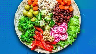
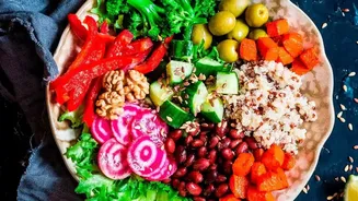
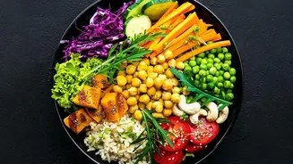
Understanding this psychology has practical implications for everyone. For chefs and food companies, attractive presentation is a key tool to enhance customer satisfaction. But this knowledge is just as useful at home. If you're trying to encourage healthier eating habits for yourself or your family, paying attention to visuals can make a big difference. Making a simple salad more appealing could be as easy as adding a variety of colourful vegetables or arranging the ingredients in a more deliberate way. This could increase the acceptance and enjoyment of healthy foods. For consumers, being aware of this bias is the first step toward making more mindful choices. The next time you find yourself drawn to a beautifully styled pastry or a perfectly arranged platter, take a moment to consider if its appearance is influencing your perception of its healthiness. This awareness can help you separate the visual appeal from the actual nutritional content.