

The Trend: What Is Colour-Blocking?
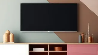
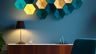
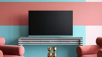
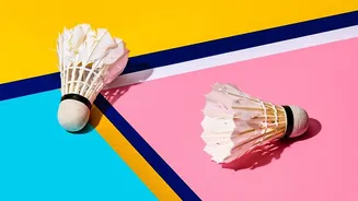
At its heart, colour-blocking is the practice of using two or more solid blocks of colour on a surface. Originating in fashion, the trend has found a natural home in interior design, offering a simple yet dramatic way to liven up a room. This might involve
painting a large arch behind a headboard to create a focal point, adding a geometric shape in a corner to zone a reading nook, or running a band of colour along the bottom third of a wall. The colours can be contrasting for a bold statement or complementary for a more harmonious feel. The beauty of colour-blocking is its versatility and accessibility; with a roll of painter's tape and a couple of paint tins, you can create a custom feature that looks intentional and modern.
The Secret: Defining Negative Space
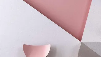
Now, let’s talk about the magic behind why colour-blocking often looks so good. The secret is something called “negative space.” In art and design, this refers to the empty space around and between the main subject or elements of a composition. Think of the unpainted part of your wall not as a blank background, but as an active and essential shape in its own right. While your painted arch is the “positive space” (the subject), the wall surrounding it is the negative space. Instead of being an afterthought, this empty area helps define the boundaries of the positive space and brings a sense of balance to the entire design. It’s the visual breathing room that prevents a design from feeling cluttered and chaotic.
Why Your Wall Needs Breathing Room
When you use negative space effectively in colour-blocked wall art, you achieve several key things. First, you create focus. The empty space acts like a frame, drawing the eye directly to the shapes and colours you’ve painted, making them feel more important and intentional. Second, it establishes balance and harmony. A room filled with too many objects or patterns can feel overwhelming. Negative space provides a visual pause, allowing the eye to rest and appreciate the elements that are there. This is why a single, well-placed painted shape can have more impact than a wall covered entirely in a busy pattern. It gives the form room to shine and prevents visual fatigue.
Using Negative Space in Your Home
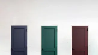
Ready to try it? The first step is to stop seeing your unpainted wall as empty. See it as an active component of your design. When planning a colour-blocked feature, think as much about the shape of the unpainted wall as you do about the shape you're painting. A great way to start is with asymmetry. Instead of perfectly centering a painted circle, try placing it off to one side. This creates a more dynamic and interesting interplay between the painted shape (positive space) and the wall around it (negative space). You can also use negative space to highlight architectural features. For instance, painting a block of colour that stops just short of a doorway makes the door frame stand out. The key is to be intentional. Consider the entire wall as your canvas, where both the painted and unpainted areas work together to create a cohesive picture.