




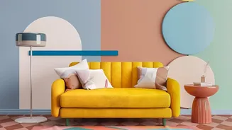

What Is Palette Balance?
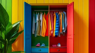
Palette balance is a core principle in design that refers to how colours, shapes, and textures are distributed to create a sense of visual stability. Imagine a seesaw: if one side is too heavy, it feels off-kilter. The same is true for a colour-blocked
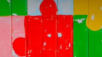
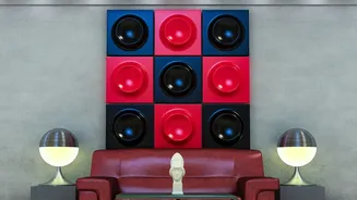
wall. If you use several bold colours in equal measure, they compete for attention, creating a visual noise that can feel overwhelming. Balance isn't about making everything symmetrical or using fewer colours; it’s about arranging them thoughtfully so the composition feels harmonious and guides the eye naturally. A well-balanced design uses different colours in varying proportions to create a hierarchy, ensuring that the overall effect is cohesive and pleasing rather than jarring.
The 60-30-10 Rule: A Designer's Secret
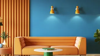
One of the most effective and easy-to-use tools for achieving colour balance is the 60-30-10 rule, a classic guideline used by interior designers. It provides a simple formula for distributing colour to create a harmonious space. Here’s how it works: 60% of your space should be a dominant colour. This is the main colour that sets the tone for the room and often covers the largest surface areas, like the main part of a wall. 30% should be a secondary colour. This colour supports the dominant hue and adds contrast and depth. 10% is your accent colour. This is where you can be bold. Used sparingly, this colour adds a pop of personality and visual interest without overpowering the design. Applying this to a colour-blocked wall ensures that no single colour dominates improperly, creating a layered, intentional look.
Beyond the Rules: Colour Psychology and Visual Weight
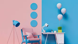
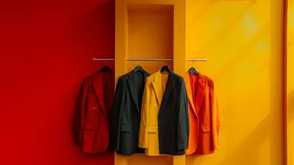
While the 60-30-10 rule is a fantastic starting point, true mastery of palette balance also involves understanding the 'visual weight' of colours. Some colours naturally feel heavier or demand more attention than others. For instance, warm colours like reds, oranges, and yellows are 'advancing' colours—they feel energetic and seem to come forward, making a space feel more intimate. Cool colours like blues and greens are 'receding' colours; they create a sense of calm and can make a space feel larger. This means a small block of vibrant red can easily balance a much larger area of a soft, cool blue. When choosing your palette, consider the mood you want to create. For a calming bedroom, you might use a large block of serene green (60%) with softer blues (30%) and a small touch of warm beige (10%). For a lively living area, a base of neutral grey could be energized with a significant portion of teal and a pop of bright orange.
Applying Balance to Your Walls
Ready to try it? Start by choosing your dominant colour (the 60%). This will likely be the foundation of your colour-blocked design. Neutrals like beige, grey, or soft whites are safe bets, but a muted colour like sage green or dusty blue can also work beautifully as a dominant hue. Next, select your secondary colour (the 30%). This should complement the dominant shade. You can choose an analogous colour (one that sits next to your dominant colour on the colour wheel) for a harmonious feel, or a complementary colour (opposite on the colour wheel) for a bolder contrast. Finally, pick your accent colour (the 10%). This is your chance to be playful. A sliver of metallic paint, a neon stripe, or a block of a deeply saturated shade can serve as a powerful focal point that ties the entire design together.
Common Mistakes and How to Fix Them
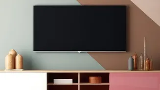
One of the most common mistakes in colour-blocking is 'colour competition', where two or more vibrant colours are used in equal amounts, fighting for attention. The fix is to decide which will be your secondary colour and which will be your accent, then adjust the proportions accordingly. Another pitfall is choosing colours with the same intensity, which can make a design feel flat. Instead, vary the tones—pair a deep navy with a lighter blue and a crisp white accent. Lastly, don't be afraid to use geometric shapes and negative space as part of your design. A colour-blocked feature doesn't have to cover the entire wall. Using abstract shapes or splitting a wall horizontally can create a dynamic effect and make the artwork feel more substantial and deliberate.