

The Power of Colour-Blocking
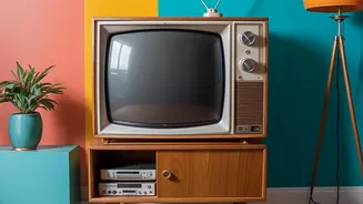
At its core, colour-blocking is the art of pairing two or more bold, solid colours together to create a striking statement. Think of it as creating a live-in abstract painting on your walls. This trend has moved from fashion runways into our homes because
it's a wonderfully direct way to inject personality into a space. By using large blocks of colour, you can define different zones in a room, highlight architectural features, or simply create a vibrant focal point that feels both modern and personal. It’s a move away from quiet, neutral interiors toward spaces that feel warm, layered, and full of life.
The Energy of Warm Colours
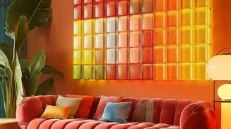
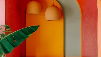
Warm hues like red, orange, and yellow are known for their ability to bring energy and intimacy to a space. Red is a colour of passion and stimulation, making it a great choice for dining rooms to encourage conversation, but it should be used thoughtfully to avoid overwhelming a room. Orange is sociable and fun, perfect for a living area or a creative workspace where you want to foster a sense of warmth and excitement. Yellow, the colour of sunshine, is all about happiness and optimism. A block of yellow can brighten up a kitchen or an entryway, making the whole home feel more welcoming.
The Calm of Cool Tones
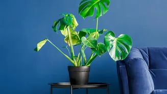
On the other side of the spectrum, cool tones like blue, green, and purple create a sense of peace and tranquility. Blue is widely considered the most calming colour, known to promote relaxation and focus, which makes it ideal for bedrooms and home offices. Green connects us to nature, bringing a feeling of balance and restoration. It’s a versatile choice that works beautifully in living rooms and bathrooms, creating a serene retreat from the busy world. Purple, depending on its shade, can evoke luxury and creativity. A deep purple can add drama, while a soft lavender can make a bedroom feel peaceful and elegant.
The Foundation of Neutrals
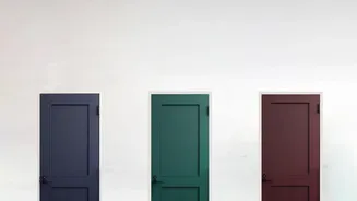
Neutrals like white, grey, and beige are the unsung heroes of colour-blocking. They provide balance and sophistication, giving the eye a place to rest amidst bolder hues. A block of crisp white can make bright colours pop, while a warm grey can ground an energetic palette. In Indian homes, which often feature rich wooden furniture or marble floors, neutrals can tie these existing elements into a modern design scheme. Don’t underestimate black, either. A sharp geometric accent in black can add a touch of elegance and dramatic flair that anchors the entire design.
How Shapes Change the Feeling
In geometric art, the shapes you use are just as important as the colours. Shapes can amplify or soften a colour’s psychological impact. Circles and soft curves feel organic and gentle, making a space feel more inviting. Squares and rectangles, with their straight lines and right angles, provide a sense of stability and structure. Triangles and other sharp, angular forms create a feeling of energy and movement, directing the eye and adding a dynamic quality to the wall. When you combine an energetic colour like red with a sharp triangle, you get a very high-impact feature. Pair a calming blue with a soft circle, and the effect is one of pure tranquility.