




Find Your Colour Bridge
The first and most important step is to create a connection through colour. Instead of trying to match everything perfectly, which can look flat, identify two or three key colours in your vintage pattern. Pick one of these shades that is either present
in or complementary to your existing furniture colour. This shared hue becomes the 'bridge' that visually links the pattern to the solid colour, making the combination feel intentional rather than accidental. For example, if you have a navy blue sofa, a vintage wallpaper with hints of navy, cream, and blush will feel instantly connected. That shared colour tells your eyes that these different elements belong together.
Play with Pattern Scale
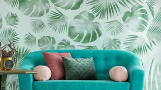
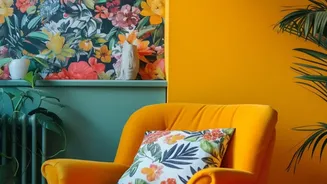
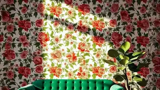
A room where every pattern is the same size will feel busy and overwhelming, even if the colours match. The trick is to vary the scale. Interior designers often use a combination of large, medium, and small-scale patterns to create depth and balance. Let one pattern be the star of the show—this is your 'hero' print. If your vintage element is a large-scale floral wallpaper, pair it with smaller, more subtle patterns on cushions or throws, like a narrow stripe or a simple geometric print. This allows the main pattern to shine while the smaller ones add texture and interest without competing for attention. The contrast in size gives the eye places to rest and makes the whole design feel more dynamic.
Let Solids Have Their Moment
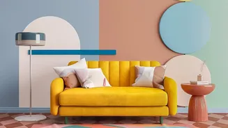
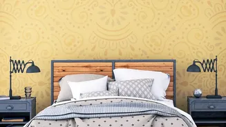
Just as important as the patterns you use is the space you leave empty. Not every surface needs to be covered. Solid colours and neutral tones are crucial for providing 'visual breathing room'. They prevent the space from feeling cluttered and allow your chosen patterns to stand out. Think of solid-coloured curtains, a neutral rug, or the clean space of a painted wall as the calm counterpoint to your vibrant vintage print. This is where your existing furniture can play a key role. A solid-coloured sofa or armchair provides a grounding element that balances the energy of a bold wallpaper or patterned rug.
Consider the Mood
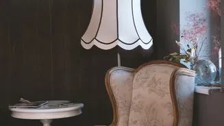
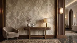
Patterns have personalities. A bold, geometric Art Deco print creates a glamorous, high-energy mood, while a soft, sprawling floral chintz feels more romantic and tranquil. Before committing, think about the feeling you want to create in the room. Does the personality of the vintage pattern align with the mood you're aiming for? Pairing a playful, mid-century modern pattern with sleek, minimalist furniture can create a fun and stylish contrast. Conversely, an ornate Victorian damask might feel more at home with furniture that has classic lines. The goal is to ensure the pattern's character supports the overall story of your space.
Start Small as an Accent
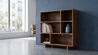
If you're hesitant to go all-in with a full feature wall, start small. Using a vintage pattern as an accent is a low-risk way to experiment. You can introduce a pattern by lining the back of a bookshelf, adding a few patterned throw pillows to your sofa, or hanging a large, framed piece of vintage fabric as art. An armchair upholstered in a beautiful vintage print or a patterned area rug can also serve as the perfect focal point without overwhelming the room. These smaller touches allow you to enjoy the beauty and character of vintage patterns while maintaining the modern feel of your existing decor.