






More Than Just Bold Choices
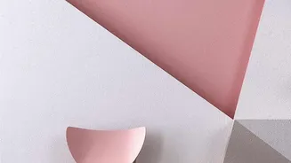
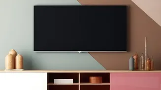
The colour-blocking trend, which uses contrasting solid blocks of colour, is a powerful way to make a statement. It can define a space, highlight architectural features, or create a stunning focal point. However, simply placing two bright colours next
to each other can often feel overwhelming or disjointed. True success lies in balance. A well-balanced palette ensures the final look is cohesive and intentional, turning a potentially chaotic wall into a work of art. This involves thinking about not just which colours you use, but how much of each colour is present and how they interact with one another. It’s the difference between a random splash of paint and a thoughtfully designed feature.
The 60-30-10 Rule: Your Foundation
A classic interior design guideline that works perfectly for colour-blocking is the 60-30-10 rule. This principle provides a simple formula for achieving harmony. Your palette should consist of three colours in specific proportions: 60% should be your dominant colour, which sets the overall tone of the space. This is often the main wall colour or largest block. 30% should be a secondary colour, which supports the dominant shade and adds visual interest. The final 10% is your accent colour—a pop of a brighter or bolder hue used to create contrast and character. This ratio ensures that no single colour overwhelms the others, creating a balanced and aesthetically pleasing result.
Understanding Colour Moods
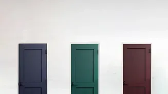
Colour theory is your best friend when planning a colour-blocked design because different combinations evoke different feelings. For a calm and serene atmosphere, an analogous colour scheme—using colours that sit next to each other on the colour wheel, like blue and green—is highly effective. These colours blend naturally and create a cohesive, harmonious look. For a more energetic and dramatic effect, opt for a complementary colour scheme. These are colours that sit opposite each other on the wheel, like blue and orange, creating a high-contrast, dynamic look. Understanding the mood you want to create will help you choose the right colour relationships for your wall art.
The Crucial Role of Neutrals
One of the most common mistakes in colour-blocking is forgetting the power of neutrals. Shades like white, grey, beige, and charcoal are not just filler; they are essential for creating balance. Neutrals act as a buffer between bold colours, providing a visual break that prevents the design from feeling too intense. They give your vibrant hues room to breathe and make them pop even more. You can use a neutral as your 60% dominant colour in the 60-30-10 rule or integrate it as a slim dividing line between two strong blocks. Incorporating neutrals adds sophistication and ensures your colour-blocked wall art feels elegant rather than overpowering.
Considering Scale and Room Size
The size and shape of your room should also influence your colour-blocking choices. Lighter colours and cool tones, like blues and greens, tend to recede, which can make a small room feel larger and more open. In contrast, dark or warm colours, like reds and yellows, advance and can make a large space feel cosier and more intimate. If you want to make a narrow room appear wider, you can paint the shorter walls a darker shade than the longer walls. By strategically placing your colour blocks, you can play with perception, visually altering the proportions of your room to create a more balanced and harmonious living space.