






The Challenge of the Calm Canvas
We gravitate towards neutral palettes—beiges, creams, greys, and taupes—for good reason. They are versatile, sophisticated, and offer a peaceful backdrop to our busy lives. They don't shout for attention, allowing architectural details and personal treasures
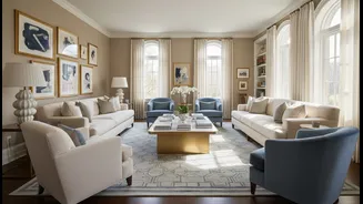
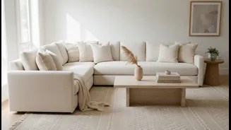
to shine. Yet, this subtlety is also their biggest challenge. When the walls, sofa, and rug are all in the same quiet colour family without careful consideration, the result can feel disappointingly one-dimensional. The room becomes flat, lacking the depth and personality that makes a house feel like a home. This is the common pitfall designers see: a space where everything is too similar, with no variation to guide the eye or engage the senses.
Mastering Contrast with Tone
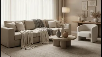
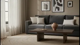
The first tool to fight flatness is tone. A tonal approach doesn't mean picking one beige and using it everywhere. Instead, it involves layering different shades, tints, and tones from the same neutral family throughout the room. Think of it like composing music; a beautiful piece needs both high and low notes. Your colour palette works the same way. If your main colour is a soft grey, introduce a deep charcoal through an accent chair or a collection of vases, and a light, almost-white grey in your curtain fabrics. This creates a gentle, harmonious rhythm. This layering of light and dark versions of a single colour family adds immediate depth and structure without feeling chaotic. A soft taupe sofa against a rich, earthy brown wall, for instance, creates a sophisticated focal point while maintaining the overall calming effect.
The Essential Role of Material and Texture
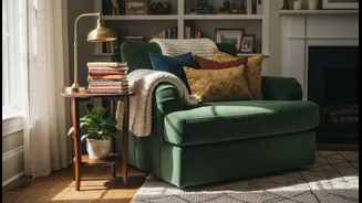
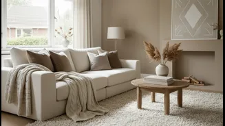
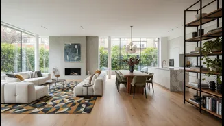
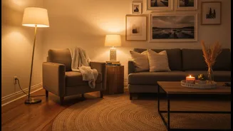
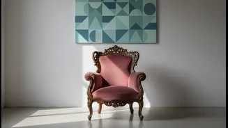
While tone provides visual depth, material and texture are what make a room feel truly rich and immersive. In a neutral scheme, texture isn't just a final flourish; it's a primary component of the design. When colour is restrained, the tactile quality of surfaces takes centre stage. The goal is to create contrast by pairing different materials. Think rough against smooth, hard against soft, and matte against shiny. This is where a neutral room gains its soul. A chunky knit throw tossed over a sleek leather armchair, a rough-hewn wooden coffee table on a plush, high-pile rug, or velvet cushions on a crisp linen sofa—these pairings are what create a dynamic, sensory experience. Each material catches light differently, further enhancing the tonal variations in the room and adding another layer of complexity.
A Symphony of Surfaces
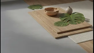
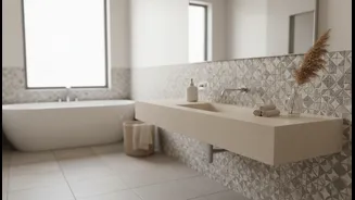
To effectively layer materials, start thinking in categories. For soft textiles, mix weaves and weights. Combine the nubby, organic feel of linen and bouclé with the luxe smoothness of velvet or the simple comfort of cotton. For hard surfaces, introduce natural elements. Wood, whether in furniture, flooring, or simple decorative objects, brings immediate warmth and an organic touch that prevents a neutral room from feeling sterile. Similarly, stone or ceramic elements add a cool, grounding counterpoint. Don't forget the power of metal. A brass lamp, a chrome table leg, or an oil-rubbed bronze bowl can act as a neutral accent, providing a point of interest and a touch of shine without adding a new colour.
Bringing It All Together
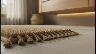
Creating this layered look is more intuitive than it sounds. Start by assessing what you have. Do you have a lot of smooth, flat surfaces? Your first move should be to introduce something with a pronounced texture, like a woven seagrass basket, a patterned rug, or pillows in varied fabrics. Look for opportunities to create simple pairings. If your sofa is a soft, matte fabric, consider a coffee table with a glossy finish or a metallic frame. If your floors are smooth wood or tile, a richly textured rug is essential to add warmth and absorb sound. Even plants can be used to add natural, organic texture. The aim is to ensure that no two large surfaces next to each other have the exact same finish and feel, building a composition that is tactile before it is visual.