





Beyond Just Picking Colours
Palette balance is the art of creating visual harmony. It's not about giving every colour equal footing, but rather distributing them in a way that feels intentional and pleasing to the eye. When a room's colour palette is unbalanced, you can often feel it—the
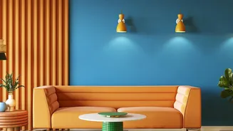
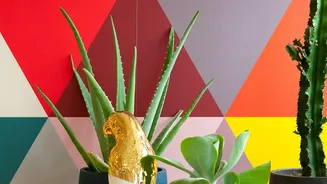
space may seem chaotic, disjointed, or visually heavy in certain spots. True balance ensures that your chosen hues work together to create a cohesive mood, whether that’s calm and serene or vibrant and energetic. This principle is especially crucial for colour-blocking, an interior design trend where solid blocks of contrasting or complementary shades are painted on walls to add depth and highlight architectural features.
The Designer's Secret: The 60-30-10 Rule
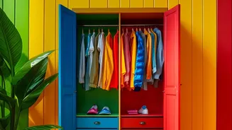
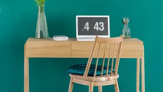
One of the most effective methods for achieving palette balance is the classic 60-30-10 rule. This decorating guideline suggests dividing your colour choices into three proportions to ensure a harmonious result. The breakdown is simple: 60% of your space should be a dominant colour, 30% a secondary colour, and 10% an accent colour. This prevents any one colour from overwhelming the space and stops the design from feeling flat or uninspired. 60% Dominant Colour: This is the main colour for your space and serves as the backdrop for everything else. It typically covers the largest surface areas, like the majority of the walls. Neutral tones such as white, grey, or beige are common choices as they create a sense of spaciousness. 30% Secondary Colour: This colour should support the dominant one and is used for about half the area of your main shade. It adds contrast and depth. This could be applied to furniture, curtains, or a single feature wall. * 10% Accent Colour: This is where you can have some fun. The accent colour is used sparingly to add personality and create visual interest. Think throw pillows, decorative accessories, and, crucially, a bold stripe in your colour-blocked wall art.
Choosing Your Harmonious Hues
The colour wheel is your best friend when selecting a palette. For a high-impact, dynamic look, choose complementary colours, which are located directly opposite each other on the wheel, like blue and orange or yellow and purple. When placed next to each other, these colours make each other appear more vibrant. For a more serene and subtle effect, an analogous colour scheme uses colours that sit next to each other on the wheel, such as blue, blue-green, and green. When colour-blocking, you can also create a sophisticated tonal look by using lighter and darker shades of the same colour. The key is to pair colours of a similar intensity to maintain visual harmony.
Applying Balance to Your Walls
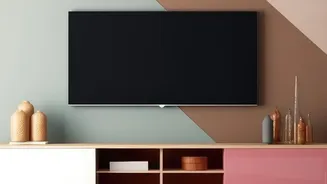
When creating colour-blocked wall art, the 60-30-10 rule can be applied directly to your design. For instance, if you're painting a large geometric shape, the main wall colour can act as your 60% dominant shade. A large painted block could be your 30% secondary colour, and a smaller, strategic stripe or shape can serve as your 10% accent. This technique is perfect for creating a focal point without overwhelming the entire room. Colour-blocking can also be used to define different zones in a room, such as sectioning off a cosy reading nook in a larger living area or creating a visual headboard in a bedroom. Don’t be afraid to think beyond simple squares; you can use painter's tape to create bold stripes, arches, or other geometric forms to make your wall a true piece of art.
Knowing When to Break the Rules
While the 60-30-10 rule is a fantastic starting point, it’s a guideline, not an unbreakable law. Great design often comes from knowing how and when to bend the rules to fit your personal style. You might decide on a monochromatic scheme, playing with different textures and shades of a single colour to add depth. Or, you could introduce a fourth or fifth colour in very small doses through artwork or decor. Ultimately, your home should be a reflection of you. Use these principles as a foundation to build your confidence, but trust your instincts. Add colours, live with them, and don’t hesitate to edit if something feels off. The most balanced room is one that feels right to you.