





Why Softer is Smarter
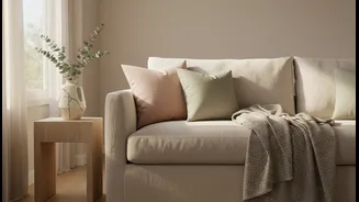
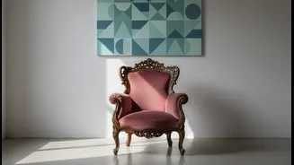
Gone are the days when an “accent” had to be a single, shockingly bright wall. Today’s approach is gentler and more sophisticated. Muted hues—think dusty rose, sage green, or pale terracotta—add personality and warmth without overwhelming the senses.
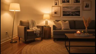
These colours create a calming, serene atmosphere that makes a room feel more inviting and can even make a small space feel larger and more airy. Unlike bold, vibrant shades that can sometimes clash or feel jarring, a muted palette provides a soothing backdrop that allows your existing furniture and artwork to shine. It’s a strategy that whispers elegance rather than shouting for attention.
Finding Your Perfect Hue
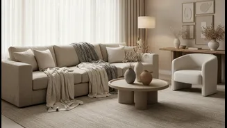
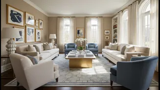
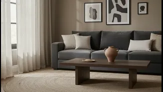
The key to success is choosing a soft accent that complements what you already own. Look at your existing furniture—the colour of your sofa, the wood tone of your tables, the pattern in your rug. If your furniture is a neutral shade like grey, beige, or cream, you have a wide array of options. A dusty blue can bring a sense of calm to a room with warm wood tones, while a pale peach can add a flattering glow. The goal is to find a colour that creates a harmonious link between your pieces, not one that competes with them. Pull inspiration from a piece of art or a patterned cushion you love. This ensures the new colour feels intentional and integrated.
More Than Just a Wall
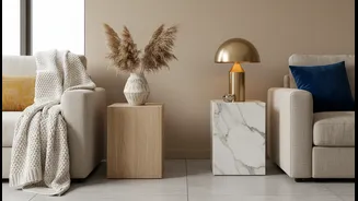
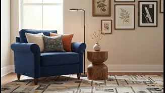
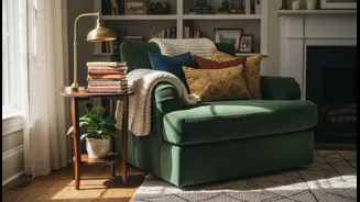
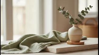
Introducing an accent colour doesn't have to involve painting. In fact, layering the colour through different textures and objects creates a richer, more professionally designed look. Think beyond the paint tin and consider textiles. A new set of cushions, a soft throw draped over the arm of a chair, or a new area rug can introduce your chosen hue effectively. Look for opportunities to add colour at different heights in the room—a vase on a bookshelf, a stack of books on a coffee table, or even a new lampshade. This technique encourages the eye to travel around the room, creating a sense of rhythm and cohesion.
Trending Tones to Consider
While personal preference is paramount, some soft shades are particularly effective for creating a modern feel. Sage green is an incredibly versatile and organic colour that connects the room to nature and pairs beautifully with whites and woods. Dusty pinks and soft terracottas bring warmth and an earthy, grounded feel that is both comforting and chic. For a tranquil, spa-like atmosphere, consider pale blues or lavenders, which evoke a sense of calm and relaxation. These “new neutrals” are popular because they provide subtle colour while maintaining a timeless and adaptable foundation for your decor.
A Simple Rule for Balance
To ensure your new accent colour feels balanced, many designers use the 60-30-10 rule. In this formula, 60% of your room is a dominant, neutral colour (like your walls and sofa). 30% is a secondary colour (perhaps your curtains or a larger piece of furniture). Your new soft accent colour makes up the final 10%, delivered through smaller items like cushions, art, and decor. This simple guideline helps you add a splash of personality without the colour taking over. It ensures the room feels cohesive and thoughtfully curated, rather than visually chaotic. The goal is to add interest, not to make every surface a different colour.