





What Exactly Is Palette Balance?
Palette balance is the art of arranging colours in a way that feels stable and visually pleasing. It’s not just about the hues themselves but how they interact. Think of it like a conversation between colours. Some are loud, some are quiet, some are warm
and inviting, while others are cool and reserved. A balanced palette ensures no single colour shouts over the others, creating a cohesive look rather than a chaotic one. This involves considering each colour's visual weight, its temperature, and its proportion within the overall design, ensuring the final piece feels intentional and harmonious.
The 60-30-10 Rule for Art
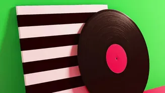
A classic interior design guideline, the 60-30-10 rule, is perfectly adaptable for colour-blocked art. It provides a simple formula for achieving balance. In your artwork, 60% of the space should be taken up by a dominant colour. This sets the overall tone. Thirty percent should be a secondary colour that supports the dominant one, while the final 10% is an accent colour—a bold pop to add personality and a focal point. This ratio helps create a clear visual hierarchy, guiding the eye smoothly across the artwork and preventing it from feeling too busy or monotonous.
Understanding a Colour's Visual Weight
Every colour has a 'visual weight'—the perceived heaviness or lightness of a hue. Dark, warm, and highly saturated colours like deep red or navy blue feel heavier and draw the eye more strongly. In contrast, light, cool, and muted colours like pastels or light greys feel lighter and tend to recede. To achieve balance in your colour-blocked piece, you need to distribute this weight thoughtfully. A large block of a 'heavy' colour on one side can be balanced by several smaller blocks of 'lighter' colours on the other. It’s a visual seesaw, and the goal is to keep it level.
Balancing Warm and Cool Tones
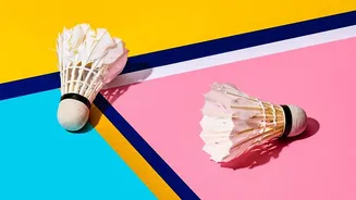
Colours are often categorised by their 'temperature'. Warm colours, like reds, oranges, and yellows, are associated with energy and can make a space feel cosier. Cool colours, such as blues, greens, and purples, create a sense of calm and openness. A successful colour-blocked design often includes a mix of both. Pairing warm and cool tones creates a dynamic visual tension that makes the artwork more engaging. For a more serene effect, you can use different shades within the same temperature family—like a deep navy with a soft sky blue—to create depth without strong contrast.
Don't Forget the 'Breathing Room'
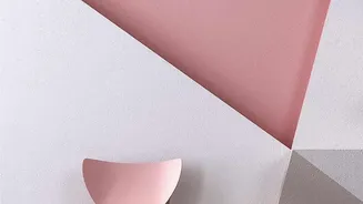
In colour-blocking, the space around the bold shapes is just as important as the colours themselves. Neutral colours like white, beige, or grey act as a crucial part of the palette. This 'negative space' serves as a buffer, preventing vibrant colours from clashing and giving them room to breathe. Treating your neutral background as an intentional colour choice helps unify the design. It provides visual relief and makes the bolder colours pop more effectively, contributing significantly to the overall sense of balance and sophistication in the final piece.
Context Is Everything: Your Room's Palette
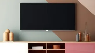
Finally, your colour-blocked art doesn't exist in a vacuum. To truly achieve palette balance, you must consider the colours already present in your room. The artwork should complement the shades of your walls, furniture, and other decor. For example, you can pull one of the accent colours from your art and repeat it in throw pillows or a vase to create a cohesive look. This final step ensures that your new wall art integrates seamlessly into your home, feeling like a carefully curated addition rather than a random afterthought.