




The Post That Launched a Thousand Debates
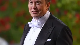
In early November 2026, Elon Musk took to his social media platform, X, to weigh in on a matter of typographic style. Responding to another user's post, he argued that the rules of English need an update. Specifically, he called for spaces to be inserted
around em dashes—the long dashes used to set off parenthetical phrases. 'The rules of English need to change to put spaces between the em dashes, as they presently too much resemble a hyphenated word, rather than a parenthetical phrase', he wrote. He also suggested the slightly shorter 'en dash' might be a better length overall. This seemingly minor observation tapped into a long-simmering war among writers, editors, and designers.
The Great Style Guide Divide
Musk's preference for a spaced dash isn't a new invention; it's the house style for many news organizations. The Associated Press (AP) Stylebook, a guide used by countless journalists worldwide, explicitly requires a space on either side of an em dash. The rationale is that it improves readability and clearly separates the parenthetical thought from the rest of the sentence. However, this puts AP style in direct opposition to the other giant of the publishing world: The Chicago Manual of Style (CMOS). Used predominantly in book publishing and academic writing, CMOS insists on a 'closed' or 'unspaced' em dash—like this—arguing that the dash itself provides all the necessary separation. Other academic guides, like the MLA Handbook, agree with Chicago, creating a clear split between journalistic and literary conventions.
A Dash of History
The em dash is not a newfangled invention of the digital age. Its origins trace back to the 15th-century printing revolution, where it emerged as a versatile mark to indicate a pause or break in thought. Its name comes from typography; the dash was traditionally the width of a capital letter 'M' in a given font. Before word processors, typewriters lacked a dedicated em dash key, so writers would type two hyphens ('--') as a stand-in, a practice that modern software now often converts automatically. The dash was popularized by authors like Emily Dickinson, who used it so frequently and expressively for rhythm and emotion that it became a signature of her work.
Digital Readability vs. Print Tradition
The debate Musk waded into is particularly relevant today because of how we consume text. On a printed page, an unspaced em dash is clean and efficient. On a smartphone screen, however, things get complicated. An unspaced dash can cause awkward line breaks, sometimes leaving the dash at the end of one line and the subsequent word on the next, which can disrupt the flow of reading. A spaced dash (e.g., 'a phrase — like this') is less likely to cause such a visual hiccup. Musk's argument for spaces, rooted in the idea that an unspaced dash looks too much like a hyphen, aligns with a user experience-focused approach to typography in the digital era. As more of our reading happens on small, variable screens, the practical arguments for spacing may start to outweigh centuries of print tradition.
The AI Connection
Adding another layer to the discussion is the rise of artificial intelligence. Some studies and anecdotal observations have suggested that large language models like ChatGPT tend to use em dashes more frequently than human writers, sometimes at a rate several times higher than a human baseline. This has led some to view the em dash with suspicion, seeing its overuse as a potential tell-tale sign of AI-generated text. While this is a statistical correlation rather than a rule, it has made some writers self_conscious about using the punctuation mark. Musk's intervention, proposing a style change on a platform that is a hotbed for AI development, places this very human punctuation debate squarely in the context of our evolving relationship with machine_generated content.