








The Deception of Digital Colour
Scrolling through an endless gallery of online paint swatches feels productive, but it’s often misleading. Computer monitors and phone screens create colour by emitting light (an additive process), while physical paint creates colour by reflecting light off
a pigmented surface (a subtractive process). This fundamental difference means the colour you see on your backlit screen is only an approximation. Screen calibration, brightness settings, and even the ambient light in your room can further distort the colour you perceive. What looks like a soft, creamy off-white online might have a strong yellow cast in reality, and a sophisticated grey could reveal an unwelcome hint of green you never saw on the screen.
What Exactly Are Undertones?
Every paint colour is made by mixing multiple pigments, and its undertone is the subtle, underlying hue that emerges from this mix. It’s what makes one grey feel cool and bluish while another feels warm and brownish. A beige might have a pink, yellow, or green undertone that dictates its overall mood. These subtle colours aren't always obvious when looking at a tiny swatch in isolation. The easiest way to spot an undertone is by comparing your chosen colour to a pure version of that colour or by placing it next to other similar shades. For instance, when you see several greys side-by-side, you'll suddenly notice that one leans blue, another violet, and a third green.
Why Physical Samples Tell the Truth
Physical paint samples are crucial because they are made of the actual paint, allowing you to see how real pigment interacts with the unique lighting of your space. This is the only way to accurately see the undertones. An undertone that was invisible online can become prominent once the paint is on a wall, influenced by everything from your furniture to the foliage outside your window. This is a phenomenon known as metamerism, where colours appear to change under different light sources. That's why the same can of paint can look different from room to room—and why a sample is your best defence against a costly colour mistake.
The Critical Role of Light
Light is the single biggest factor that alters how we perceive paint colour. A room with north-facing windows receives cooler, bluer light that can exaggerate grey and blue undertones. In contrast, south-facing rooms get bright, warm light that can bring out yellow and orange undertones. The colour will also shift throughout the day, from the golden light of morning to the cooler tones of the afternoon and the warm glow of artificial bulbs at night. Different types of light bulbs—incandescent, fluorescent, or LED—also cast their own colour temperature, further influencing how the paint and its undertones appear.
The Right Way to Test Paint Samples
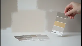
To get an accurate read, don’t just paint a small square directly on your current wall; the existing colour will skew your perception. Instead, paint two coats on a large piece of white poster board or lining paper. This allows you to move the sample around the room to see how it looks on different walls and in various lighting conditions. Place it near your trim, your sofa, and your flooring to see how it complements other fixed elements. Live with your samples for at least 24 to 48 hours. Observe them in the morning, at noon, and at night under artificial light. The colour you still love after two days is likely the winner.