As much as the best Italian performance cars have pushed boundaries in performance and styling, there's also another element that makes them so desirable among collectors. It's hard to define exactly what
that is, but it's probably best summed up as heritage. These cars tell the stories behind the founding and successes of each Italian brand, the passion that drives the desire to build the world's greatest cars, and the imagery of legendary racing drivers piloting their racing creations.
The one piece of any Italian sports car that arguably ties it to that heritage more than anything else is the logo on its hood. The very best are recognised the world over, and have the added bonus of being among the coolest vintage car logos ever designed. Virtually every car enthusiast will recognize them, although not everyone might be aware of their origins, some of which took inspiration from unlikely sources.
Read more: 5 Classic Cars That Featured Swivel Front Seats
Ferrari
The prancing horse adorning every Ferrari is one of the most instantly recognizable logos in the automotive world. Its origins stretch back far beyond the establishment of the Ferrari brand, to the First World War. It first appeared as a logo on the fighter planes flown by renowned Italian pilot Francesco Baracca. About 5 years after the end of the war, Baracca's parents met Enzo Ferrari, then a young racer. The story goes that they suggested to Ferrari that he put the black prancing horse on his machines, just like their son did, as it would give him better luck.
Ferrari liked the idea and began to use the image on his race cars, complete with a yellow background to pay tribute to the official color of his home city, Modena. He later formed the Scuderia Ferrari race team, which again used the black prancing horse logo with a yellow background, although initially the race team used Alfa Romeo race cars. The team's racing success, combined with its founder's successful personal racing career, was enough to convince him that the logo was indeed a provider of luck.
After parting ways with Alfa Romeo, Ferrari launched his eponymous carmaking brand in 1947. The brand's logo was never in doubt: It was to be the same prancing horse that had brought him good fortune for more than two decades already. It's since taken pride of place on all of Ferrari's best-looking cars, and brought its maker countless more race victories.
Alfa Romeo
Formed initially as A.L.F.A. in 1910 before becoming Alfa Romeo when businessman Nicola Romeo took over the company, the Milanese automaker's logo has evolved only slightly since it was first created. In the earliest days of the company, a friend of one of its co-founders suggested that the logo could use the Biscione Visconteo, a mythical dragon snake that had served as the powerful Visconti family's crest in medieval Italy.
After some trial and error, the founders eventually settled on a final design that included both the snake and the flag of Milan, a red cross on a white background. The company's logo would be surrounded by a blue crown that contained the company's name, its founding location of Milan, and depictions of two Savoy knots, a traditional symbol of Italian royalty.
A notable change to the logo occurred shortly after the Second World War, as Italy had become a republic and its royal family had been exiled. The Savoy knots were ditched, and the logo was recolored in red and gold. This proved to be a short-term change, as by 1950, the company was back to using its original color scheme, which is still in use today. The latest tweaks to the logo, which remove the dividing line between the snake and flag, were introduced in 2015.
Lamborghini
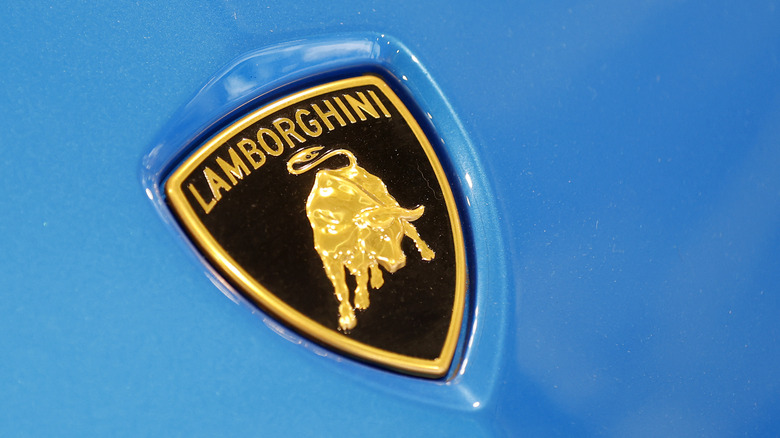
Although Lamborghini has been a part of VW Group since the late '90s, it hasn't lost any of its Italian spirit. The nameplate first appeared on Ferrucio Lamborghini's line of tractors, but when he decided to make his own supercar company, he decided to commission a fittingly dramatic new logo. Lamborghini was born under the Taurus star sign and was reportedly keen to portray himself as bull-like in his approach to business. Setting out with the goal of building the best supercars in Italy — thus dethroning Ferrari — was certainly the move of someone who saw themselves as strong and determined as a bull.
Lamborghini also went one step further and named his cars after different fighting bulls. Even today, the tradition endures, with all of Lamborghini's flagship model names having some connection to a famous bull. The Urus SUV is an adaptation of the word aurochs, a prehistoric species thought to be the precursor to the modern fighting bull, while the Revuelto is reportedly named after a famous Spanish bull from the 1880s. The brand's smaller supercar, the Tememario, takes its name from a different fighting bull from the same era. Evidently, Lamborghini's obsession with bulls is as strong as ever, with its logo being a reflection of that.
Maserati
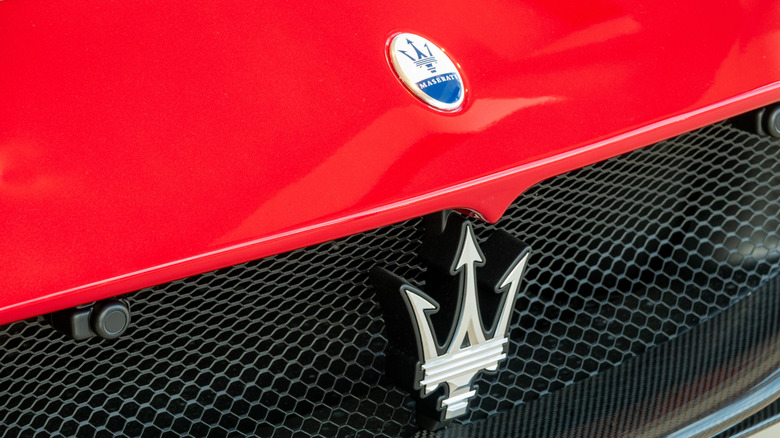
Maserati was founded by five brothers, with four of them being keen racing enthusiasts. The youngest brother, Mario, wasn't as fussed about racing glory, but had studied arts and had a keen eye for design. It is Mario Maserati who is credited with designing the automaker's famous trident logo, with his inspiration reportedly coming from a statue in his home city of Bologna. The statue was of the Roman god of the sea, Neptune, who is traditionally depicted carrying a trident. Mario thought the triple-pronged spear would make a great logo, and the other Maserati brothers agreed.
Even throughout Maserati's tumultuous ownership history, including periods spent under the ownership of Citroën and De Tomaso, the famous trident logo has remained unchanged. It can be found on every one of the greatest Maseratis ever built, from the 8CTF to the MC12, although strangely enough, it also briefly appeared on some motorcycles, too.
Maserati sold off its spark plug division in the early 1950s, but thanks to a legal error in the sale process, it accidentally allowed the spark plug business the right to use the logo. The new owner didn't wait to capitalize on the error, quickly buying up a small motorcycle manufacturer and rebranding it under the newly acquired Maserati name and logo. By the end of the decade, the motorcycle brand had suffered financial issues. It collapsed, allowing Maserati, the carmaker, to correct its mistake and regain the sole use of its logo.
Abarth
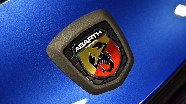
Lamborghini isn't the only Italian sports car manufacturer to take inspiration for its logo from a star sign. Abarth's scorpion logo was also initially conceived as a reference to its founder Carlo Abarth's Scorpio sign, but that wasn't the only reason that the logo was styled on the animal. It was also reportedly down to the fact that a scorpion logo was hard to draw, and so could not easily be counterfeited, and it also fitted Abarth's philosophy of building cars that were small but mean.
Abarth is best known for its high-performance versions of popular Fiat models, but it has released a string of uniquely designed cars over the years, too. One of its more recent unique creations was the Abarth 1000 SP Roadster, which was based on the Alfa Romeo 4C and paid tribute to one of Abarth's classic race-winning designs. In 1971, Carlo Abarth's small independent operation was purchased by Fiat, and since then it has remained under the latter's ownership, today becoming part of Fiat's parent company, Stellantis.
Want the latest in tech and auto trends? Subscribe to our free newsletter for the latest headlines, expert guides, and how-to tips, one email at a time.
Read the original article on SlashGear.