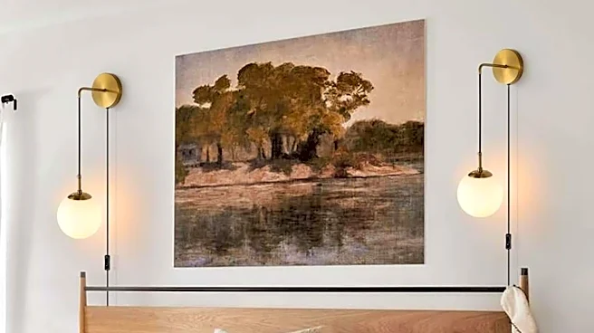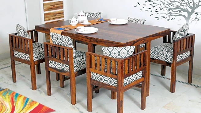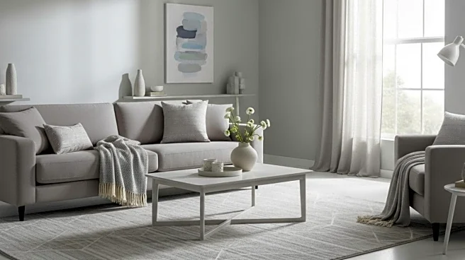


Neutrals have moved far beyond their role as a safe backdrop. In today’s interiors, they are the main event – quietly powerful, deeply expressive, and inherently timeless. When handled with intention, a single calm colour palette can create richness, warmth, and depth without relying on bold contrasts or visual drama. The key lies not in adding colour, but in mastering tonal variation, texture, light, and materiality. This approach to layering neutrals defines a new kind of luxury – one that feels serene, personal, and effortlessly refined.
Why Neutrals Are No Longer Just A Background
“In modern interiors, neutrals are no longer simply a background choice. They define the space itself,” says Ekta Verma, Principal and Founder, Interior Designer, ETOS Designs.
According to her, the success
of a neutral interior lies in restraint and nuance rather than contrast. “The secret lies in nuanced variation rather than strong contrast,” she explains. Begin with choosing a single neutral family – beige, taupe, soft grey, or warm ivory – and building gentle tonal shifts within it. “Walls, ceilings, and large furniture pieces stay within this spectrum to create a seamless foundation,” Verma shares, allowing the space to feel cohesive rather than flat.
Depth Through Texture, Not Colour
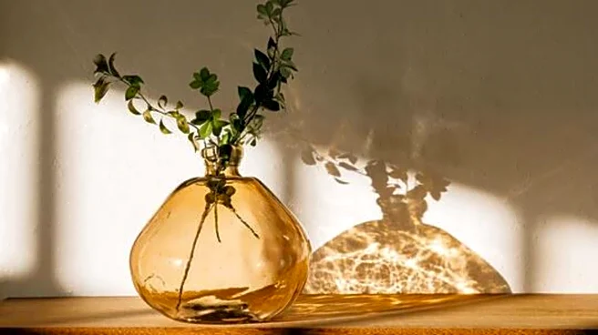
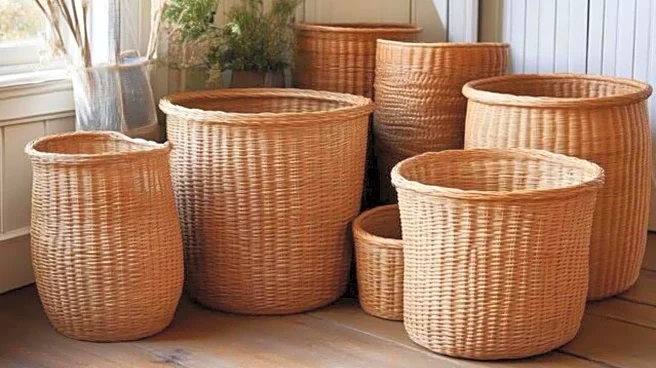
If colour is kept quiet, texture does the talking. “Depth is introduced through texture,” Verma explains, pointing to finishes like limewash walls, natural stone, linen upholstery, fluted wood, and woven textiles. These elements add dimension while maintaining visual calm.
Architect Mrudula Indur, founder and principal designer of Diksuchi Design Studio, echoes this sentiment. “Instead of adding contrast through colour, rely on texture and material,” she says. For Indur, neutrals are not static shades but a feeling that evolves across surfaces – lighter on walls, deeper in furniture, and softer through fabrics.
How Light Brings Neutral Palettes To Life
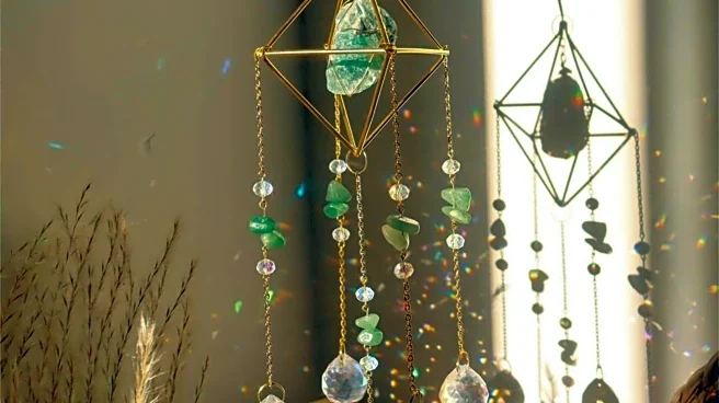
Lighting is often the unsung hero of layered neutral interiors. “Light plays an equally important role,” says Indur, noting how shadows and highlights gently reveal layers as the day progresses. Warm, layered lighting – ambient, task, and accent – allows neutral surfaces
to shift in mood from morning to evening.
Verma agrees, adding that warm lighting enhances the character of neutral finishes. “Natural materials further elevate the palette, bringing an organic richness that prevents the space from feeling flat or sterile,” she says.
The Power Of Tonal Variation And Material Balance
“A neutral palette is often misunderstood as being plain or repetitive. In reality, when layered thoughtfully, neutrals can be one of the most powerful tools in interior design – quiet, refined, and deeply expressive,” says Kavya Sethi, Founder at Walnut Studio and Principal Designer at Woodcraft International.
Sethi highlights the importance of subtle tonal shifts. “Even the smallest shift in undertone can change how light moves through a room,” she explains. Flooring, curtains, upholstery, and furniture must speak to each other without competing, ensuring harmony rather than monotony.
Her current favourite? A soft, cold coffee tone – warm yet muted – that works beautifully as a base across finishes and furniture. To elevate the look, she introduces restrained champagne gold accents. “Never loud, just enough to add quiet luxury,” she notes.
Layering neutrals is less about playing it safe and more about designing with confidence and restraint. Through tonal variation, texture, thoughtful lighting, and natural materials, a single calm palette can feel rich, dynamic, and deeply personal. When done right, neutral interiors don’t fade into the background; they quietly define spaces that feel timeless, comforting, and effortlessly luxurious.