What is the story about?
What's Happening?
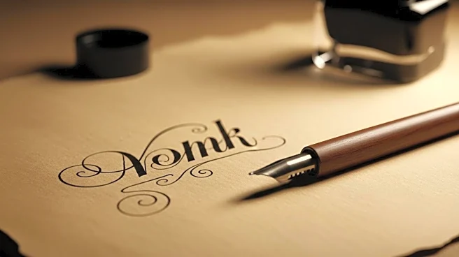
Jonathan Anderson, the artistic director of Dior, has introduced a significant change to the brand's visual identity by reviving the Cochin font. This font, originally chosen by Christian Dior in 1946, is named after the 18th-century French engraver Charles-Nicolas Cochin. Anderson discovered carved wooden blocks of the Dior logo in the brand's archives, which inspired the return to this historical typeface. The new font, featuring a capital 'D' followed by 'ior' in lowercase, was discreetly launched on the clothing labels of the spring/summer 2026 menswear collection. The color scheme remains unchanged, maintaining the iconic 'dove gray' and white combination emblematic of Dior.
Why It's Important?
This change marks a symbolic return to Dior's roots, emphasizing the brand's heritage and historical significance. By reviving the Cochin font, Dior reinforces its connection to French cultural history and craftsmanship. This move could strengthen brand loyalty among consumers who value tradition and authenticity. Additionally, it highlights the importance of visual identity in luxury branding, where even subtle changes can have significant impacts on brand perception and market positioning. The decision to revert to a historical font may also influence other luxury brands to explore their archives for inspiration, potentially sparking a trend of heritage-focused branding in the fashion industry.


