


What is the story about?
What's Happening?
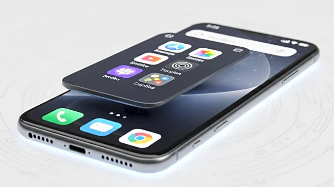
Users of iOS 26 are experiencing issues with Dark Mode app icons appearing tilted due to new highlights added to certain icon corners. This optical illusion, exacerbated by the Liquid Glass aesthetic, has led to complaints of dizziness and misalignment, particularly against darker backgrounds. The problem arises from uneven lighting effects that vary depending on the user's background. While the Reduce Transparency setting does not resolve the issue, users can opt for a Tinted customization to mitigate the visual discomfort.
Why It's Important?
The tilted icon issue highlights the challenges of aesthetic changes in software updates, impacting user experience and satisfaction. As Apple continues to innovate with design elements like Liquid Glass, user feedback becomes crucial in refining these features. The problem underscores the importance of thorough testing and user-centered design in software development. Addressing such issues promptly is vital for maintaining customer loyalty and ensuring a seamless user experience.
What's Next?
Apple may need to consider user feedback and potentially release updates to address the tilted icon issue. Users seeking immediate relief can explore customization options like Tinted icons to reduce visual discomfort. As discussions continue on platforms like Reddit, Apple might engage with the community to gather insights and improve future updates. The company could also enhance its testing processes to prevent similar issues in upcoming releases.