
What's Happening?
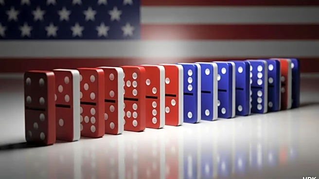
Domino's Pizza has introduced a new logo and box design that prominently features the colors red, white, and blue, reflecting a shift towards more inclusive and American themes. This redesign marks the company's first major makeover in over a decade. Marketing experts suggest that this change is a response to consumer backlash against brands perceived as promoting 'woke' themes. The new design aims to evoke the Star Spangled Banner, aligning with a broader trend among companies to emphasize patriotism in their branding. Despite the rebranding, Domino's has maintained steady growth, indicating that the change is more about gaining momentum rather than recovering from a downturn.
Why It's Important?
Domino's decision to emphasize American patriotism in its branding reflects a significant shift in consumer attitudes and corporate strategies. As brands face backlash for political messaging, Domino's is positioning itself to appeal to a demographic that values patriotic themes over divisive politics. This move could strengthen its connection with consumers who prioritize national identity and inclusivity. The rebranding also highlights the importance of aligning corporate identity with consumer values, which can impact brand loyalty and market positioning. By focusing on American themes, Domino's may enhance its appeal to a broader audience, potentially driving further growth.