
What's Happening?
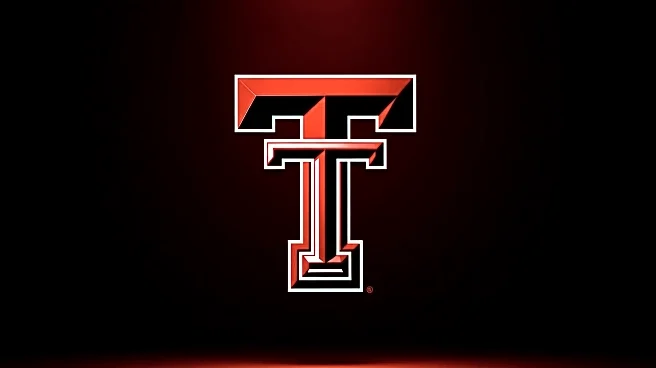
Texas Tech University has introduced a new logo design, which has elicited a range of reactions from college football fans. The updated 'Double T' logo features a flat design with red and white colors, reminiscent of the school's historical look. This change is part of a broader rebranding effort that includes new secondary logos and a style guide set to launch in spring 2026. The redesign was conducted in collaboration with a creative agency and Adidas, aiming to blend tradition with modern aesthetics.
Why It's Important?
The unveiling of a new logo is significant for Texas Tech as it represents an effort to modernize the university's brand while honoring its history. The mixed reactions highlight the challenges institutions face when updating iconic symbols. For Texas Tech, the new logo could influence its identity and marketing strategies, potentially affecting merchandise sales and fan engagement. The response from the community underscores the emotional connection fans have with traditional symbols and the impact of branding decisions on public perception.
Beyond the Headlines
The logo change at Texas Tech reflects broader trends in sports branding, where institutions balance tradition with contemporary design to appeal to diverse audiences. This move could set a precedent for other universities considering similar updates. The reactions also reveal cultural dynamics within fan communities, where nostalgia and modernity often clash. The long-term success of this rebranding effort will depend on how well it resonates with both current supporters and potential new fans.