


What is the story about?
What's Happening?
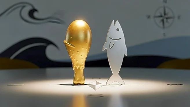
Long John Silver's has redesigned its logo, replacing the iconic fish emblem with a chicken, reflecting a shift towards more chicken-focused offerings. The new logo includes the phrase 'Chicken + Seafood' and has already been updated on the company's website and social media accounts. This change comes as the restaurant tests new poultry dishes at its flagship location in Louisville, Kentucky, which have received positive feedback from guests. The rebranding is part of a broader strategy to emphasize chicken products, which have become increasingly popular in the fast-food industry.
Why It's Important?
The decision by Long John Silver's to rebrand its logo signifies a strategic shift in response to changing consumer preferences in the fast-food industry. As fried chicken continues to dominate the market, the company aims to capitalize on this trend by highlighting its chicken offerings. This move could attract a new customer base and increase sales, while also challenging traditional perceptions of the brand as primarily a seafood restaurant. The rebranding reflects the dynamic nature of the fast-food industry, where companies must adapt to evolving tastes to remain competitive.