


What is the story about?
What's Happening?
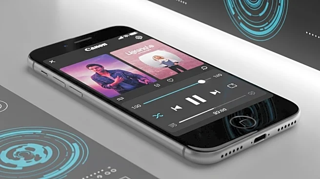
YouTube Music has introduced a significant redesign of its Now Playing interface for both Android and iOS platforms. This update, which began testing in November, features a dual-pane view that enhances user interaction. The redesign relocates the Song/Video switcher and introduces a new boxy scrubber, replacing the traditional playhead. The controls are now more compact, with a carousel format that includes options like thumbs up/down, comments, and lyrics. The update also introduces a new 'Up Next' section, allowing users to view and manage their playlists or radio stations more efficiently. This redesign is being rolled out via a server-side update, and users can force the update by stopping the app from the multitasking menu.
Why It's Important?
The redesign of YouTube Music's Now Playing interface is a strategic move to enhance user experience and engagement on the platform. By streamlining controls and introducing a dual-pane view, YouTube Music aims to make navigation more intuitive and efficient, potentially increasing user satisfaction and retention. This update could also position YouTube Music more competitively against other music streaming services by offering a unique and user-friendly interface. The changes reflect a broader trend in app design towards more interactive and visually appealing user interfaces, which can significantly impact user engagement and platform loyalty.
What's Next?
As the redesign continues to roll out, user feedback will likely play a crucial role in further refinements and updates. YouTube Music may monitor user engagement metrics to assess the impact of the redesign on user satisfaction and retention. Additionally, the platform might explore further enhancements or new features based on user preferences and technological advancements. Competitors in the music streaming industry may also respond with their own interface updates to maintain or improve their market positions.