


What is the story about?
What's Happening?
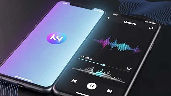
YouTube Music has launched a significant redesign of its Now Playing interface on both Android and iOS platforms. This update, which began testing in November, introduces a dual-pane view that enhances user interaction by allowing easier access to features such as lyrics, song/video switcher, and a new 'Up Next' section. The redesign moves the song/video switcher from the top, integrates a new boxy scrubber, and compacts the control carousel. This update is being rolled out via a server-side update, and users can force stop the app or remove it from the multitasking menu if they do not see the changes immediately.
Why It's Important?
The redesign of YouTube Music's Now Playing interface is significant as it aims to improve user experience by making navigation more intuitive and efficient. By streamlining access to features like lyrics and the 'Up Next' section, YouTube Music is enhancing its competitive edge in the music streaming market. This update could potentially increase user engagement and satisfaction, thereby strengthening YouTube Music's position against competitors like Spotify and Apple Music. The changes reflect a broader trend in app design towards more user-friendly interfaces that prioritize ease of use and accessibility.
What's Next?
As the redesign rolls out, user feedback will likely play a crucial role in further refinements. YouTube Music may continue to iterate on this design based on user interactions and preferences. Additionally, the company might explore similar updates for other features within the app to maintain a cohesive user experience. Competitors in the music streaming industry may also take note of these changes and consider similar updates to their platforms to keep pace with evolving user expectations.