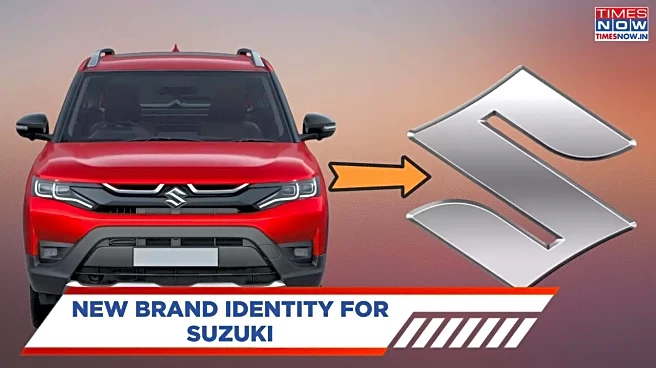

Suzuki has introduced a redesigned emblem after 22 years of its previous version, which initiates a new visual approach for the brand. The upgrade retains the recognisable “S” silhouette but the structure
applied to this redesign highlights digital aesthetics, sleeker lines, and sustainability. It also resonates with Suzuki’s renewed corporate slogan "By Your Side", and suggests a readjustment of its visual identity as it prepares to present concept models at the Japan Mobility Show 2025. This is not just a cosmetic tweak; it is how Suzuki wants to project itself in the new scheme of things in the car industry.
Also Read: New Skoda Octavia RS India Pre-Bookings Confirmed - Date And How To Book
Suzuki New Logo: What’s New Under the Badge
The new logo keeps the core shape of Suzuki’s well-known “S” but drops the old three-dimensional looks for a flat, more minimal look. Chrome plating is gone and in its place is an eco-friendly “high-brightness silver” paint that shows a modern and digital-friendly style. Though this new badge retains the same size as the last one, it has sharper lines that focus more on clarity than on extra details.
Intent And Brand Messaging
Suzuki describes the redesign as not merely a facelift but rather as a reflection of the renewed corporate mission of the brand. The new emblem goes with the slogan “By Your Side”, involving more commitments to the customers and innovation in mobility solutions. Also, its flatter design is best in use for digital and mobile applications where simple, scalable graphics perform at their best.
Rollout Plan And Application
The concept models͏ at the Japan Mobility Show this October 30 will be the first to ta͏ke on Suzuki’s new emblem. After that, it will gradually find i͏ts way into production vehicles, and become par͏t of corporate materials an͏d brand identity assets. In India, where Maruti Suzuki has a significant presence, expect to s͏ee this new logo on all upcoming domestic models and brand implementa͏tions.
Also Read: Mahindra Bolero Range Prices Revised Post GST 2.0 — Check All Variants Here
Why This Change Matters
This shift isn’t just cosmetic. In a visually crowded market, consistency in branding across digital and real-world touchpoints is key. A flatter logo integrates better into apps, websites, and vehicle interfaces without losing identity. It also signals to consumers that Suzuki is positioning itself for a more digital, sustainability-focused future. The restrained update helps the brand stay current without abandoning legacy recognition.
Stay updated on all the latest automotive trends with Times Now Auto.


/images/ppid_a911dc6a-image-177084603066450478.webp)


/images/ppid_a911dc6a-image-177084257810510483.webp)
/images/ppid_a911dc6a-image-177084253417916956.webp)